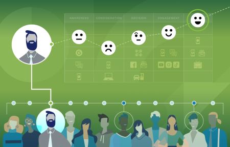
Article How Customer Journey Mapping Guides Brand Growth Proper customer research and strategy have the power to create experiences that resonate and drive growth. Learn the art of understanding your audience through Customer Journey Mapping.
Article Brand Promises that Work: Five Tips and Examples Brands with strong promises draw customers due to their clear differentiation and impactful purpose. Explore five examples of brand promises that inspire belief.
Podcast The Power of Combining Brand and Performance Marketing Balancing brand and performance marketing is an important step to drive results for your company. What are each of these marketing styles and when should you use each?
Article Branding Beyond Consumerism The purpose of a brand extends far beyond a tool for selling products. Learn how brands build connections and inspire through meaningful values.
Article What's the Importance of Building a Leadership Brand? Leadership brands transcend traditional leadership roles to establish a consistent approach that aligns with the company's core values and objectives. Learn about the value of leadership branding and how to build one.
Article How Employee Value Propositions Create High-Performing Brands A robust EVP aligns seamlessly with a company's mission, vision, and values, and acts as a catalyst for corporate strategy. Learn the value of clearly defining your EVP.
Podcast The Employee Impact on a Brand More and more, companies are realizing that their employees play a major part in supporting and building their brand. As the front line of a brand, the way they align themselves with the mission, vision and values of a brand can have a major impact on the success of that brand's perception in the minds of its customers.
Article Why Branding for Aesthetics Won't Save You Sometimes, a simple external change isn't enough to address the root of a problem in an organization. Learn how a successful rebrand goes beyond the superficial to inspire belief.
Article How to Build an Inbound Marketing Strategy (With Examples) Inbound marketing has the power to engage your audience through meaningful content that speaks to their needs. Learn step-by-step how we built our own inbound marketing strategy and how you can get started creating your own.
Podcast Maintaining Brand Relevance: The Fall of the Pac-12 Chris sits down with BrandExtract CEO and President Bo Bothe to discuss the impact of the Pac-12 collapsing, what its significance for brands is, and what might happen next.
Podcast Why is Brand Research Important? Research is often overlooked when starting a branding project. But our experts are here to tell you why that can be a critical mistake and what you need to consider when undertaking branding research.
Article How Audience Strategy Shapes Interactive Experiences That Convert In the ever-evolving world of interactive experiences, understanding your target audience is paramount. Learn how to design experiences that cater to your audience so they stay engaged.
Article 4 Questions About AI Answered by Branding Experts With AI's new and improved ability to create content, how can brands navigate the world of generative tools like ChatGPT? Bo, Jonathan and Donovan answer some common questions.
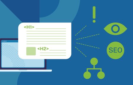
Article Why Using Correct Headings is Vital to Your Website Headings structure content, enhance readability, aid accessibility, and help with SEO. But in the vast majority of sites, they are almost always used incorrectly. Learn how to use headings to maximize your site's impace.
Podcast How Does AI Change the Landscape for Brands? Artificial intelligence presents all sorts of exciting opportunities to innovate in branding and marketing. Discover some of the ways AI might shake up the market for brands and what their top priorities should be.
Podcast Building Brand Trust in B2B In today's highly commoditized market, building trust in your brand is crucial for success. Explore the significance of building trust in B2B brands and what companies can do to cultivate it.
Article How Your Brand Voice Can Speak Volumes A distinct voice can establish your brand’s purpose and value to your customers. Learn the basics of brand voice and why it matters to your company.
Article 7 Usability Mistakes That Are Hurting Your Brand Time and time again, we've seen companies violate usability best practices. It hurts your brand and it hurts your bottom line, 100% of the time.
Podcast How Customer Journey Mapping Helps You Understand Your Audience Knowing your audience is half the battle when it comes to leaving a lasting impact with your brand. Learn about some of the ways journey mapping helps build empathy with an audience.
Article Five UX Tips to Strengthen Your Brand in 2023 A strong user experience will keep customers coming back for more. Use these five tips to set your website or app apart in 2023.
Podcast The Basics of Inbound Marketing In this episode, the team breaks down the basics of inbound marketing and how it's different from outbound marketing. Join Chris, Laura and Taylor as they discuss how inbound marketing helps brands build trust with their audience.
Article The Impact of Data Science on Branding Data science can help brands drive meaningful change. Find out how a statistical modeling framework can help connect the dots, make informed decisions and outperform competitors.
Article Building a Brand From the Inside Out Building a brand has to start with the people inside your company. Learn why internal branding makes a huge impact for your organization's success and growth.
Podcast What is Brand Strategy? What does it actually look like to build a brand strategy, and what are the building blocks that make it work? Learn the basics of brand strategy with insights from veteran brand strategists and leaders.
Article Google Analytics 4: What’s Changing and What You Need to Know The switch from Universal Analytics to Google Analytics 4 is quickly approaching, and the time to prepare is now. Read this guide to learn what you need to know for the transition.
Article Revolutionizing Branding: Harnessing Big Data and the IoT The internet of things, or IoT, is poised to revolutionize branding. President and CEO, Bo Bothe, breaks down its impact on brands.
Article What to Know About Upcoming WCAG Changes In September of 2022, the W3C announced that the next version of the WCAG had reached candidate reccomendation status, which means barring any eleventh hour changes, version 2.2 of the standard should be ratified soon. The changes are relatively minor, but anyone who has some responsiblity for a website's construction or matienance should be aware of what's coming.
Article ESG 101: What is it, and Why Does it Matter? ESG is becoming a commonplace word in the world of corporate data collection and reporting. Learn the basics of what ESG means, and why it matters to your company.
Article 4 Examples of Successful B2B Digital Marketing Strategies Learn B2B digital marketing strategies you can apply to your own brand. See real examples from four clients and get tips to determine if a similar approach will work for you.
Article Why Branding May Be The Only Way to Stand Out in Today’s Market In today's market, it's getting harder to tell the difference between the limitless amount of products and services. Read why branding is one way you can reliably stand out.
Podcast Branded House vs. House of Brands: What's the Difference? Your brand architecture has major impacts on the way people perceive your brand. Learn the different strategies, and discover how they have different impacts on your business.
Article Web Typography: 5 Frequently Asked Questions Web typography helps define your brand's personality and communicate information. Learn the importance of typography for your website and your company.
Article 3 Steps to Create Branded Content That Earns Shares Learn the 3 steps to creating unique, valuable content that not only aligns with your brand identity, but earns shares among your target audience.
Podcast How a Visual Identity Builds Brand Equity Visual identity is a major driver for building brand equity and becoming recognizable. In this episode, Chris, Cynthia, Doug and David discuss the building blocks of visual identities and why they matter.
Article The Beginner's Guide to Writing Website Content A complete guide on how to build website content that engages audiences while adhering to search engine parameters.
Article How Web Accessibility and Usability Go Hand in Hand Accessible design is a way of ensuring that your site works for everyone. Learn how web accessibility can improve your site and benefit your brand.
Podcast How ESG Sites Benefit Your Brand What makes an ESG website different from a PDF report? Chris sits down with Jonathan and Donovan to talk about all the ways ESG sites allow brands to manage risk and share their sustainable vision.
Article How Strong Brands Thrive During the Great Resignation The Great Resignation introduces a lot of uncertainty to the market. Learn how strong brands fortify their companies with clear communication and vision.
Podcast Branding Considerations During Mergers & Acquisitions During mergers and acquisitions, the importance of branding is often overlooked. Discover key considerations for brands during mergers and acquisitions.
Article Why Usability Testing is Important to Your Site Usability testing can help identify areas of your website that need improvement, and make your site more effective for your users. Learn how testing for usability maximizes the ROI of your site.
Article What is Inbound Marketing for B2B Brands? What is inbound marketing? In short, it combines several forms of content marketing to boost sales. Learn how it moves customers along the buyers journey.
Article 3 Challenges and Advice for Brands in 2022 In today's rapidly-changing social and economic climate, brands are facing new challenges to their identity and growth. Learn about the three most important issues brands face today, and how they can begin to address them.
Article 6 Essential Digital Marketing Skills From analytical to storytelling skills, learn about what you need to do to keep your digital marketing skills sharp.
Podcast Preparing for Innovative Branding in 2022 Between supply chain difficulties and advances in automation, brands are sure to require innovative strategies to keep up in 2022. Tom McDonald, author of "Paving the Way: Innovation, Talent and the Path Forward," joins BE to discuss how to build an innovative brand in 2022.
Article Inbound Versus Outbound Marketing Inbound vs outbound marketing - inbound is better for lead generation and sales. Cheaper, too. See inbound stats to prove it here, with inbound examples.
Article Rebranding Strategy: Building a Brand Relaunch Plan After an Acquisition Get guidance to lead a rebrand after an acquisition, merger or other major business turning point. Gain insight from a company that successfully relaunched.
Article Brand Strategy: How Branding Drives Real Business Growth As buyers gain influence, companies are turning to branding to differentiate themselves in the marketplace. Discover how a strong brand drives real business growth.
Article A Guide to CCPA Website Compliance Get step-by-step instructions for making your website CCPA-compliant in this California Consumer Protection Act Mega-Guide.
Article Apple iOS 15's Email Tracking Issues & How to Handle Them Learn about Apple iOS 15's email tracking challenges and get tips for handling them.
Article A Beginner’s Guide to Building a Brand in 2022 If you have a strong brand, you’ll get more people to buy your product at higher prices for longer periods of time. That’s a win for you and your business.
Article Breaking Down Digital Marketing Tactics for B2B Brands What is digital marketing strategy? What do digital strategy tactics look like? Read about that and more with plenty of digital marketing examples.
Podcast The Branding Impact of N-I-L Join the BrandExtract team as we discuss the impact the new N-I-L ruling will have on NCAA brands and athletes.
Article How to Use E-A-T to Build Your Brand E-A-T is more than just mysterious criteria used by Google to judge your website, it's an opportunity to improve your brand. Learn how you can use EAT to build your brand.
Article 3 Reasons to Use HubSpot for Inbound Marketing HubSpot collects almost every marketing feature you need, all in one place. Read these three reasons BrandExtract uses HubSpot inbound marketing.
Article Getting Started: Google Analytics Guide To know what is and isn't working with your website, web analytics are crucial. Read our guide to Google Analytics and figure out how to elevate your site.
Article B2B vs B2C Marketing: A Compare and Contrast Knowing your audience is critical to crafting a successful marketing strategy. We break down the differences and similarities between B2C and B2B customers.
Podcast The Keys to Building a Modern Brand with Chris Payne Having a strong, consistent visual identity for your brand is more important than ever. We chat with Football Brand Designer, Chris Payne, about why a strong, scalable identity helps brands build trust and brand believers.
Article Segmentation: The Most Overlooked Strategy for Winning at Recruiting and Fundraising in Education Most schools continue to use bulk, branded content when it comes to recruiting and fundraising. That's a mistake. Learn how segmentation can provide you better targeting for scholastic recruiting and fundraising.
Article Case Study: Building Engagement with Digital Strategy This Digital Strategy Case Study shows how we used HubSpot & digital marketing to increase lead generation and sales. See the results & creative process here.
Article Sales Funnels Aren't Dead, Just Different Sales funnels aren't dead, just different. Remember, the sales funnel was created in 1898. Read about how the way we communicate has evolved.
Podcast How To Launch Your First ESG Report Without Experience Tackling your first ESG report can be overwhelming, especially with no prior ESG experience. We walk through critical success factors for your first ESG report.
Podcast The SEO Impact of Good Branding Good branding engenders loyalty and creates advocates. It can also boost your website's organic visibility. Discover the SEO benefits of branding.
Podcast Brand Analysis: Elon Musk Why have Elon Musk's brands achieved so much success and how can they improve going forward?
Article Why We Rebranded: A Step-by-Step Breakdown of the Process We're taking a leap forward with a brand that better conveys how we help our clients inspire belief in an ever-changing world. This is our rebrand story.
Article Building Brand Integrity Through ESG Reporting Expectations are changing. More and more, stakeholders expect radical transparency from companies beyond financials.
Podcast Should Brands Take a Stance on Polarizing Issues? What should brands do in highly polarized times? Should they take pick sides? Or is it best if they remain neutral? Listen in and find out.
Article B2B Buyer Personas: 6 Frequently Asked Question In order for any business to be successful, it has to understand its customers. We cover six frequently asked questions about B2B buyer personas.
Resources & Presentations Sports Team Branding: 5 Identity Breakdowns The summer of 2020 has seen a flurry of sports brand launches. Our team breaks down five of the most high-profile sports brand launches from brand positioning to their visual identities.
Podcast What Role Does ESG Reporting Play in Supporting Your Brand? We chat with Kaitlyn Allen and Amanda Hsieh from Global Affairs Associates about the impact of ESG reporting on long-term viability of companies and the strength of their brands and the future of ESG.
Article The Truth About Copyright Notices on the Web Do website copyright notices even matter? Is everyone doing it wrong? We cover the new service from the U.S. Copyright Office and share best practices for your website.
Article How Can Brands Rise Above Commoditization? While the digital age has revolutionized commerce at scale, it's getting harder and harder for brands to differentiate on quality or price. So how can brands stand out?
Article It's Time To Start Thinking About What's Next Our world has fundamentally changed because of COVID. It's time to help our customers and ourselves do more than survive we must help each other thrive.
Article Cross-Generational Selling: How to Bridge the Buyer Gap The American workforce is changing and growing more diverse. One of the biggest shifts is generational. Learn more about the different generational mindsets and how to overcome buyer barriers in today's markets.
Podcast The Importance of Internal Branding and Communications Internal branding and communication are paramount in times of change. Learn why each are critical to your brand's ability to weather tough economic times and uncertainty.
Resources & Presentations How To Leverage LinkedIn To Grow Your Business LinkedIn can be a powerful channel to grow your personal brand and your business. Learn how to optimize your LinkedIn profile to build brand awareness and generate leads.
Resources & Presentations The Collaborative for CUBES™ Method Our partnership with the Collaborative for CUBES™ merges data science and branding to achieve actionable, measurable results. Discover the process here.
Article Expanding Margins: The Right Way to Grow You don't need to add new costly features to grow your margins. Explore how overall customer satisfaction can increase margins for B2B companies.
Article Multiplier Customers: Targeting Profitable New Clients Multiplier customers help firms grow their business organically in a variety of ways. Learn about their characteristics and how to identify them.
Podcast The Power of Branding in a Stalled Economy During a recession, brands must adapt. So how do you ensure that your brand remains viable in trying times? We offer insights and tips on how to do just that.
Resources & Presentations The Ultimate Guide to Choosing the Best CMS for Your Website Our guide to the best content management systems can help you determine the best CMS for your site. Access the guide and discover the best option for your next website project.
Article Busting the Value Trap: How B2B Companies Can Increase Sales B2B companies often fall into the 'value trap' of cutting prices and increasing operational costs. Discover what the trap is and how to avoid it.
Podcast The Impact of COVID-19 on Brands COVID-19 has changed the way brands do business globally. Listen in as our experts discuss how business has changed and talk about the lasting impacts of the Coronavirus.
Article How Branding Impacts SEO Branding is a powerful business solution that can get customers to buy more, pay more, make quicker purchasing decisions, and become brand advocates. See why it's also an undervalued SEO tactic.
Podcast How Brands Can Rise Above Commoditization In this episode, our team breaks down why commoditization is on the rise and what you can do to ensure your brand doesn't get lost in the shuffle.
Podcast Brand Analysis: Disney Disney is one of the world's most popular brands. How have they been able to sustain growth while staying true to their core values? Our experts analyze the Disney brand and what has made them so successful.
Podcast 5 Trends That Will Influence Brands in 2020 and Beyond Our experts discuss trends that brands will see in 2020 and how to handle the challenges they might bring.
Article Five Trends That Will Influence Brands In 2020 And Beyond Technology has grown to be a major focal point of differentiation for brands. As we move into the future, these trends will influence how brands operate to gain market share.
Article Designing for the Future We Want: How Usability Can Have a Lasting Impact on the World We believe that all companies should care about usability; not only because it can impact business and the bottom line, but also because it's the right thing to do.
Article Turn Compassion Into Action By Avoiding These 8 Accessible Design Mistakes Accessible design respects the uniqueness of all individuals, regardless of age and ability by recognizing that all people are not just like you.
Podcast How ESG Reporting Can Give Companies a Competitive Edge Is it important that companies demonstrate a commitment to all stakeholders, not just shareholders?
Podcast How the Internet of Things is Revolutionizing Branding The evolution of the internet of things (IoT) physical objects capable of gathering and sharing data is poised to revolutionize branding.
Podcast Why Website Accessibility is Critical for Your Brand With lawsuits on the rise, it's critical for businesses to understand the risks associated with having an inaccessible website.
Article 6 of Our Favorite Books to Help You Create, Transform, and Grow We've found that reading books together helps develop a common language, making it easier to discuss new ideas or think more strategically about our work. Here are 6 of our favorites.
Article Is ESG Reporting Right for Your Brand? We'll help you understand the implications of the UN Sustainable Development Goals and determine if sustainability reporting is appropriate for your brand.
Article Internal Branding Strategy and its Impact on Brand Equity Think that internal branding is only important to your employees? It can also impact the rest of your business -- including recruiting efforts and even your bottom line.
Article What You Need to Know About Cause Branding Cause branding has become integral to a business' strategy. Learn how to engage in cause branding, what factors to consider, as well as what to avoid when implementing your strategy.
Article A Complete Guide to the California Consumer Privacy Act The California Consumer Privacy Act was signed into law on September 23, 2018. Discover how this affects organizations that do business and handle consumer data within the state.
Article How to Measure Your Target Firm’s Brand Value for Mergers & Acquisitions Discover the method you can use to quantify the worth of your target firm's brand ahead of any potential merger or acquisition. Capturing this insight can help you make informed decisions that align with your business strategy.
Podcast How to Develop a High-Performing Website Your website is vital to your brand. So it needs to deliver a seamless experience and consistently meet the needs of your target audience. In this episode we discuss the elements that support a high performance website.
Article How to Make Your Site Mobile-Friendly and Rank in Google Google is prioritizing websites in search rankings that are optimized for mobile devices. Find out how to ensure your site is mobile-friendly and meets user and search engine needs at the same time.
Article How You Can Measure the Financial Impact of Your Product or Service Financial impact analysis (FIAs) models play a crucial role in your ability to demonstrate the worth of your product or service and more. Learn how FIAs can drive business performance for you and your buyers.
Podcast What You Need to Know About Managing a Major Brand Growth is great but what happens when you haven't planned for that growth? The BrandExtract team discusses how companies can manage brands at risk of becoming too big to handle.
Podcast Why More B2B Companies Are Focusing on Branding to Drive Business How does B2B branding compare to branding in B2C? Our experts compare and contrast the two and take a look at the emerging interest in branding in the business-to-business arena.
Article 4 Steps to Value Chain Mapping Discover how to map your value chain and surface important business insight with our high-level framework. From setting up the project team to documenting the delivery cycle, we cover essential steps that can help you deliver on your brand promise.
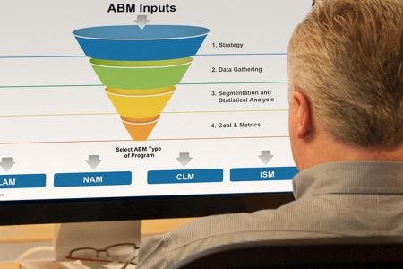
Podcast What is Account-Based Marketing? A Strategic Guide to ABM In this episode our experts discuss Account-Based Marketing and everything you should consider before employing your own ABM program. Learn what you need to know about ABM here.
Podcast Which Customer Metrics Best Predict Financial Performance? In this episode Dr. Vikas Mittal joins CEO, Bo Bothe, to discuss which customer success metrics are most effective for gauging business success and what role a brand plays in the process.
Podcast GDPR: What U.S. Companies Need to Know How does the GDPR affect companies in the U.S.? Our experts discuss what American businesses need to consider in preparation for this legislation, how to prepare, and how to remain compliant.
Article The Beginner's Guide to Web Accessibility Roughly one-in-eight people in the U.S. have a disability. Failure to accommodate such a large audience limits the positive impact a website can have on your business. Learn how you can make your websites accessible to everyone.
Podcast Brand Analysis: The NCAA What are the challenges facing the NCAA? Are they fulfilling their stated purpose? Listen to this podcast to learn why the NCAA's perception may not be an accurate depiction of who they really are.
Article How to Measure Brand Value for Mergers & Acquisitions In the wake of increasing M&A activity, potential acquirers need to ensure target firms can deliver strong returns. Discover how measuring brand value can accelerate your growth strategy.
Article GDPR for U.S. Websites: Everything You Need to Know The EU's General Data Protection Regulation (GDPR) won't only affect member states but also U.S. companies that do business in Europe. So what do we need to know and do about being GDPR compliant?
Podcast Is Cause Branding Right for You? In this episode our experts talk about the ins-and-outs of cause branding and what to consider when you're choosing the causes with which to align your brand.
Article How to Create Engaging (and Converting) Business Websites Is your website actually engaging and converting prospects at a rate that reflects your business goals? Discover the layers that make up high performing business websites.
Podcast What is Brand Insulation? How You Can Future-Proof Your Brand Dr. Vikas Mittal deconstructs the concept of brand insulation by examining how to create a brand that inspires loyalty and offers examples of highly insulated brands.
Article CMS Security: How to Keep Your Website Safe Websites are under greater threat from hacking than ever before. As vulnerabilities continue to be exploited, we take a look at how you can optimize the security of your CMS and remain proactive.
Article Corporate Rebranding Process: Shawcor A strong brand inspires belief not only among a firm's customers but also its investors. We used a data-driven approach to understand Shawcor's customer needs as inputs to developing a strategic approach to branding.
Podcast How to Create Content That's True to Your Brand When you set out to create content for your brand, it's vital to stay true to your brand voice. Learn about creating content that's true to your organization in this episode.
Podcast Using Data Analytics to Optimize Marketing Spending In this edition you'll learn how to use data and analytics to allocate marketing budgets and how to avoid common pitfalls that misalign the marketing plan and the business strategy.
Article Why Is Value Chain Mapping Vital to Business Performance? When you map your organization's value chain, you can establish a clear picture of the delivery cycle of your product or service. You can uncover profound insights that protect your business, drive growth and fortify your brand position.
Podcast How to Manage a Brand Through a Crisis What should you do if your brand finds itself in the middle of crisis? In this episode, we discuss the role of your brand in a crisis and offer real-life examples of how (and how not to) handle a those situations.
Podcast Why Branding is a Powerful Business Solution Our experts take a deep dive into branding and its many benefits to your business. We discuss why the branding process is much more than a communications exercise and the problems you can solve with it.
Podcast Branding and the 4 Factors That Influence the Buy American Concept The Buy American concept is a popular one among today's brands but it is also a nuanced strategy. In this episode our experts explore the concept, what makes it effective and if you should consider it for your brand.
Podcast Cohesive Branding During Controversy: The NFL's Anthem Response In today's NFL, players have as big a platform as ever but what should they (and other brands) consider if they decide to take a stance on an issue? Find out in this installment of the Solving for B Podcast.
Article HTTP vs. HTTPS: Understanding Security Warnings in Google Chrome Starting in October 2017, the Google Chrome browser will show a "Not Secure" warning on any web page that has an input field and is served over HTTP instead of HTTPS. How will this affect your brand?
Podcast What is Brand Identity? How to Align Your Brand With Your Ethos There's a lot more to designing a brand than meets the eye. In this episode of our podcast, our experts discuss all the angles to consider when designing a brand that truly reflects your company.
Podcast Debunking the Top Five Branding Myths There is lots of misinformation out there about branding a business or organization. In this episode we address some of the common myths associated with branding.
Article Arms Wide Adoption Services Embraces Change for Strategic Rebrand Explore how a data-science driven process helped influence the new brand look and feel for Houston-based adoption services agency, Arms Wide Adoption Services.
Podcast How Branding Plays a Major Role in U.S. Politics Branding historically has a significant role in elections and in the political process. In this episode, our team deconstructs what role branding plays in politics and who that played out in the 2016 election cycle.
Podcast Brand Analysis: Southwest Airlines In this episode of the podcast, we dissect the Southwest Airlines brand and what makes them a model for branding success. Take a listen to learn more.
Podcast Branding vs. Marketing: What's the Difference? What's the difference between branding and marketing? How are they the same? How are they similar? Our experts break down the nuanced world of branding and marketing in this installment.
Podcast How to Create Believers in Your Brand to Help Your Company Grow How does a brand create believers? And what does that mean? Let our experts tell you why it is important for brands today to inspire belief and how you can engender loyalty from those efforts.
Article How to Navigate Your Brand Strategy Through a Changing Economy No matter how the recent economy has affected your business, our country is in a period of change. Now, more than ever, is the time to ensure your brand has long-term strength, as well as where to prioritize your branding efforts.
Article How to Align Your Sales Strategy and Your Brand Using Playbooks Keeping each of your sales tools and marketing campaigns aligned with your brand's identity is important this way, you display a consistent brand to each of your different stakeholders.
Article How to Build an Effective Account-Based Marketing Program You've launched a new website, implemented a customer relationship management (CRM) strategy and invested in a marketing automation program, but are still not seeing results from your ABM efforts. Here's how to build an effective ABM program.
Article How to Build a Content Strategy for Your Sales and Marketing Teams Develop a content strategy your marketing and sales teams can use. Get tips to help your teams work together, communicate effectively and leverage content.
Resources & Presentations How to be a Lean Marketer in Any Environment Whether you're facing unstable market conditions, budget cuts or layoffs, discover how to create value and secure your role with lean marketing strategies.
Article How to Build ROI and Accountability Into Your Marketing Plan Develop a marketing plan that drives greater ROI. Get tips to help your team stay accountable, complete planned activities and reset if necessary.
Article Branding in the Legal Industry: Close up on Identity Design Explore brands we've developed for top law firms like Fulbright, BoyarMiller and more. See how the right brand identity supported their success.
Resources & Presentations LinkedIn Tips to Market Your Personal Brand and Business Learn how to optimize your LinkedIn profile to generate meaningful results for your business. Get more visibility and expand your professional network.
Resources & Presentations How to Build a Subcontractor Partnership With an Agency Learn how to get noticed and get hired as a subcontractor with a branding, marketing or advertising agency. We share our tips for earning more work.
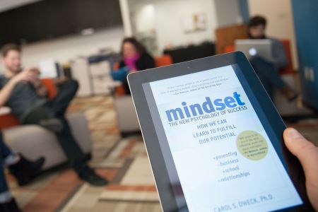
Resources & Presentations The Impact of Mindset on Our Work and Culture Learn how mindset impacts our work and company culture. Read takeaways from our office's discussion of Mindset by Carol S. Dweck.
Article Logo Retrospective: Branding for Social Good We look back on the brands and logos we have created over the past 10 years for non-profit organizations.
Article The Role of Brand in a Downturn: Spotlight on the Oil Industry The BrandExtract C-Suite reveals the worst branding mistakes you can make in a downturn and the opportunities you should seize immediately. Read the article to discover what it takes to survive and thrive in an economic downturn.
Article Why Our Team Has Invested in a Growth Mindset Approach We've built our business around inspiring people to create, transform and grow and that mission is at the core of our internal culture as well. We chose Carol Dweck's book because of its emphasis on learning rather than an individual's fixed traits.
Article How to Prove Branding and Marketing ROI for B2B Measuring your marketing ROI with strategic tests and experiments will build the value of your B2B business.
Article Brand Consistency Strategies That Will Boost Your Business Value Brand consistency builds company value, reinforces your market position and attracts better quality customers. Learn strategies to assess and strengthen your brand.
Article 7 Frequently Asked Branding Questions From building brand awareness to transferring brand equity during a divestiture, we answer seven of the most frequently asked branding questions.
Article Brand Transformation: What, Why and How? What do you do when you experience a drop in sales? How do you react when growth outpaces your predictions? Both could be a reason to reevaluate your brand.
Resources & Presentations Branding and the Power of 10 Discover how branding impacts the repeat customer business, price point and lead quality, as well as how to measure branding ROI.
Resources & Presentations The Elements of User Experience Get a presentation of all the factors that contribute to overall UX, including Information Architecture, Usability Engineering and Interaction Design.
Resources & Presentations The Beginner's Guide to Writing Website Content BrandExtract's comprehensive guide to writing for the web covers the topics relevant to business owners, entrepreneurs, and new writers learning about web content best practices.