News
BrandExtract Receives Four ANA Lantern Award Nominations


We're excited to announce that four of our projects from the past year have been nominated for the 2019 Lantern Awards of Texas. The Lantern Awards recognize the most high-quality and strategic business-to-business communicators in the industry.
We received nominations for the following projects and categories:
Archrock Video: Our Time is Your Uptime
The Archrock video was a critical piece in our efforts to reposition Archrock, a leading provider of natural gas contract compression services, and emphasize the service aspect of their business. Our goal was to personalize the Archrock brand by giving employees a compelling story to share both internally and externally.
"We were really pleased with how the video turned out," said Brand Strategist, Leslie Rainwater. "Video has a unique ability to enhance a brand message and tell a story that isn't always possible through other mediums. We decided not to script the Archrock employees; as a result, we felt the video made the brand much more personal and service-oriented."
Through the video, we emphasized that the Archrock brand was about the macro ("we have a global presence") and the micro ("we're right here, and here's the person who is helping you"). We used the video as part of an internal HR campaign and a brand launch campaign. The video galvanized employees and generated positive energy and excitement around the brand launch and the company's mission, vision, and values.
WillScot Videos: Ready to Work
Modular building provider, WillScot, had grown and evolved as a company through acquisitions and entering the public market. We developed the company's brand position of "Ready to Work" in order to emphasize WillScot's ability to deliver an immediately functional solution for its customers.
As part of this strategy, we developed three videos to support sales in communicating the company's differentiators in the marketplace and fuel WillScot's digital marketing efforts: first, to highlight its innovative FLEX product; second, to focus on its turnkey solution to provide all additional furnishings to quickly make spaces workable; third, to communicate its overall value in providing modular spaces to help easily address customer pain points. We concepted, scripted, storyboarded, and oversaw the production of the videos.
"These videos continue to play an important role in Willscot's marketing efforts," said Brand Strategist, Elizabeth Tindall. "We wanted to create a set of videos that would continue to provide value for the sales and marketing teams for a few years after their release. With the music and animations, the videos really help bring to life the value Willscot offers its customers."
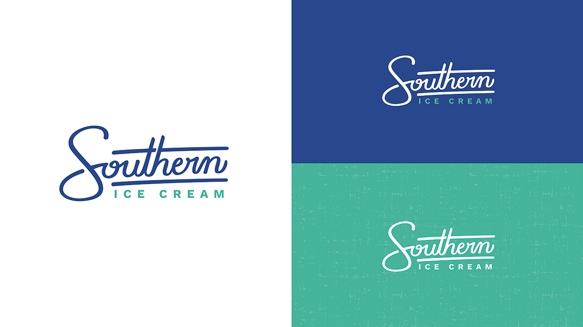
Southern Ice Cream Rebrand
For Texas-based ice cream distributor, Southern Ice Cream, we developed a strategy around the idea of "delivering happiness" through their ice cream distribution and events to emphasize the service component of their brand – a key differentiator.

As a result, we designed a new logo to feel warm (no hard edges), whimsical (at a slight angle), and approachable (hand-drawn) to communicate the fun, positive, and joyful characteristics of the Southern Ice Cream brand. The colors are cool but also radiate warmth, and the lines – depicting an ice cream sandwich – pull in the product at a high level.
"This was such a fun project for our team," said Brand Strategist, Laura Ehrlich. "With the rebrand, we felt like we were able to bring to life the emotions surrounding the experience of sharing ice cream with friends, family, neighbors, and coworkers."
Disaster Recovery Services Logo Design
Disaster Recovery Services (DRS) needed a new identity to match its sophisticated business approach. DRS wanted a logo to speak to how they approach disaster-related problems and emphasize their personal approach to helping people.

The mark creates a "D" with lines that come together like holding hands while the arrows indicate positive, restorative movement resulting in a return to normalcy. There is meant to be a sense of continuity that DRS will be there to support clients, no matter what, and will help clients get back to business, as usual, more quickly.
"With the new logo, we wanted to emphasize the personal support offered by DRS," said Art Director, Margo Lunsford. "Service and relationship are a huge part of the brand and we were able to bring that to life in a variety of ways with the logo."
The awards will be presented at the Lantern Awards Gala Exhibition & Awards Dinner on Thursday, November 21 at The Ballroom at Bayou Place.


