Article
Turn Compassion Into Action By Avoiding These 8 Accessible Design Mistakes

Accessible design respects the uniqueness of all individuals, regardless of age and ability. It starts with recognizing that not all people are just like you.
In order to best serve different users, it's imperative to understand and empathize with all kinds of people. Following WCAG 2.0 AA guidelines makes content accessible to a wider range of people with disabilities, including blindness and impaired vision, deafness and hearing loss, learning disabilities, cognitive limitations, limited movement, speech disabilities, or photosensitivity. To ensure you're serving each user that visits your website, avoid these eight accessible design mistakes.
1. Keyboard Traps
Some people who use assistive technology rely on visible on-screen actions. Good design, therefore, ensures that all content related to navigation is visible. Be sure to order items logically (top left to bottom right) to help users understand the content and make informed choices about the navigation.
Tips:
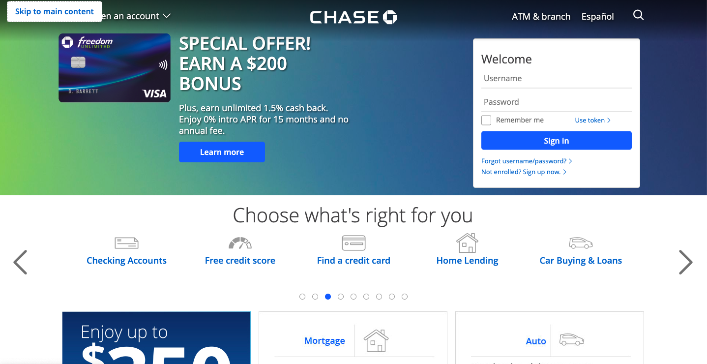
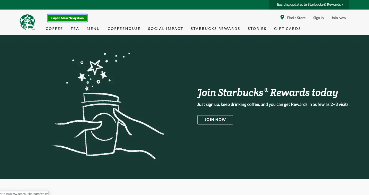
- Main content: Consider providing a way for users to easily skip top-level navigation to access the main content.
- UI patterns: Follow the semantics of common patterns such as Toggle, Tabs, Tables, Modal Windows, and ARIA attributes.
- Hover usage: Do not hide text or actions behind a hover state. If a keyboard-only user cannot see that a content/buttons exists, they cannot navigate through the page.
Good Skip Links Example #1
Good Skip Links Example #2
2. Insufficient Color Contrast
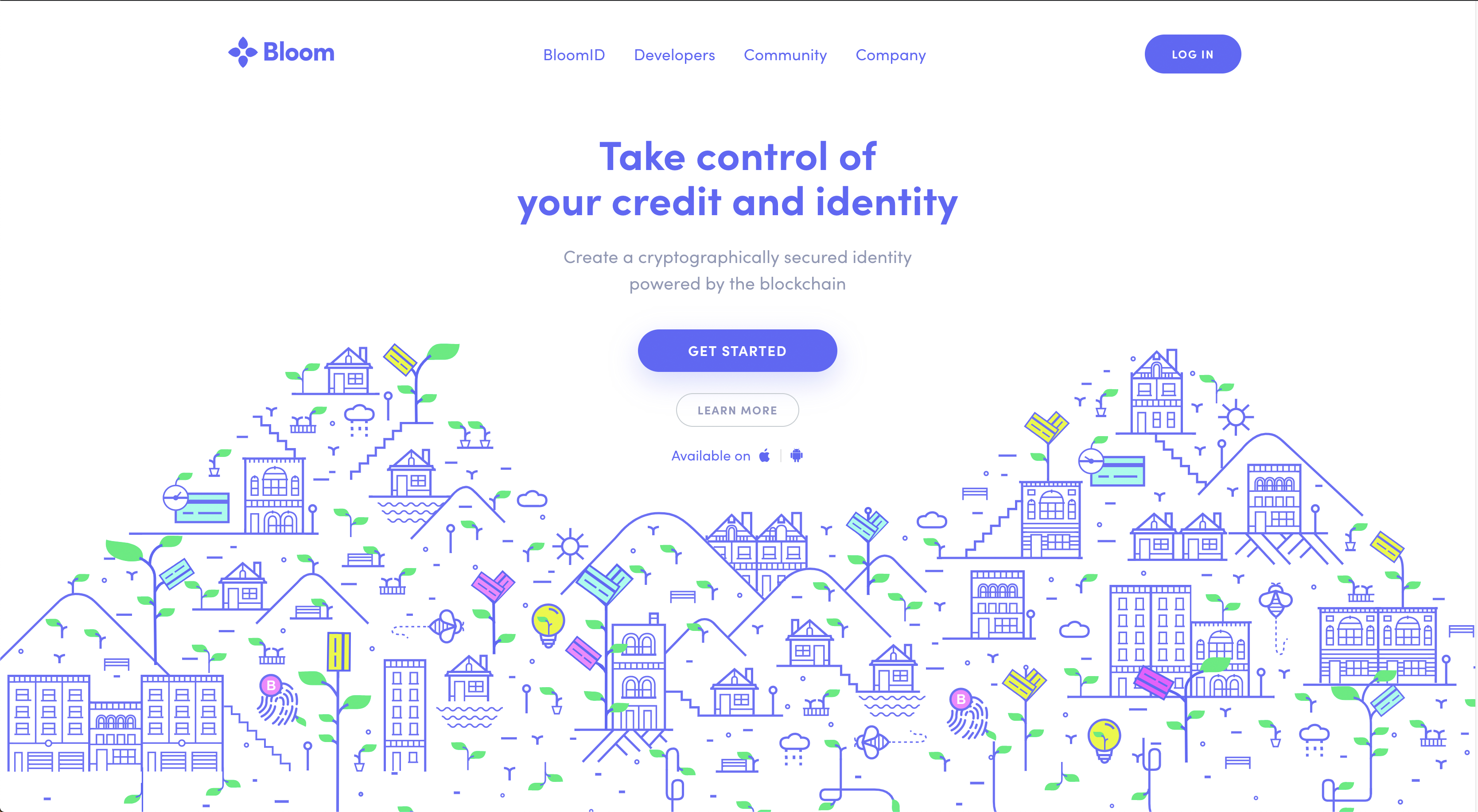
Insufficient color contrast affects people’s ability to receive information visually. Make sure there is enough contrast between text and its background to ensure text is readable. The contrast ratio between text and the text’s background should be a minimum of 4.5 to 1. However, if your text is least 24 pixels or 19 pixels bold, the minimum drops to 3 to 1.
Tips:
- Color palettes: Be conscious of primary colors. Plus, keep color contrast requirements in mind when choosing colors.
- Don't rely on color alone: Use combinations of shape, color and text (not just one by itself) to convey meaning, and be consistent. Provide at least two indicators so that people who cannot easily distinguish colors can still understand your content.
- Exceptions: Text, images of text, pictures, and logos that are not required to understand the meaning of the content, or are pure “decoration.”
Example of Insufficient Contrast
3. Text in Images
Avoid using images of text that are intended to be read. Use actual text that is styled with CSS rather than image-based text presentation. In situations where images of text must be used, the alternative text must contain the same text presented in the image.
Tips:
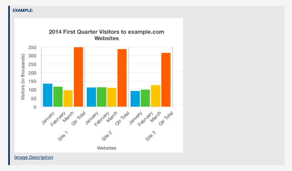
- Diagrams, charts, tables: Use real text in data visualizations. If real text isn’t possible, a textual representation of the essential information conveyed by the image is essential. Ex: Long description or list view.
- Exceptions: Logos, branding elements, and graphics that have good descriptive text alternatives.
Example of Good Text in Image
4. Hidden Focus States
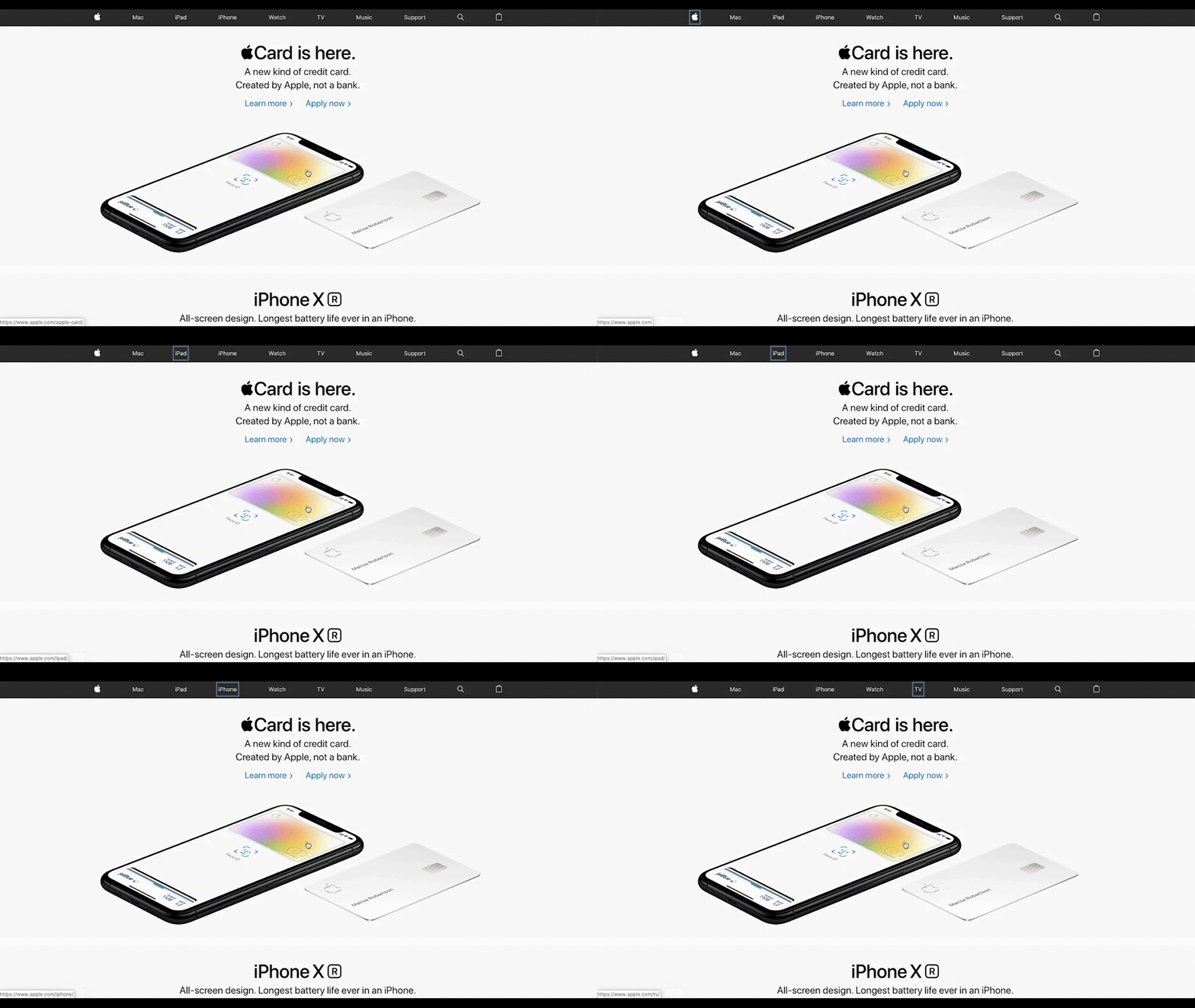
Focus states help users navigate and understand where they are. Never hide them. Focus states are important to key-board users. It helps them understand where they are on a page. To test your site, try tabbing through your page and find your focus.
Tips:
- Focus states: If you remove the default focus states, be sure to replace them with something that works better than what your browser provides.
- Input states: Consider what happens to labels when you focus inside of an input.
- Page actions: Clearly define the focus side effects of actions.
Hidden Focus States
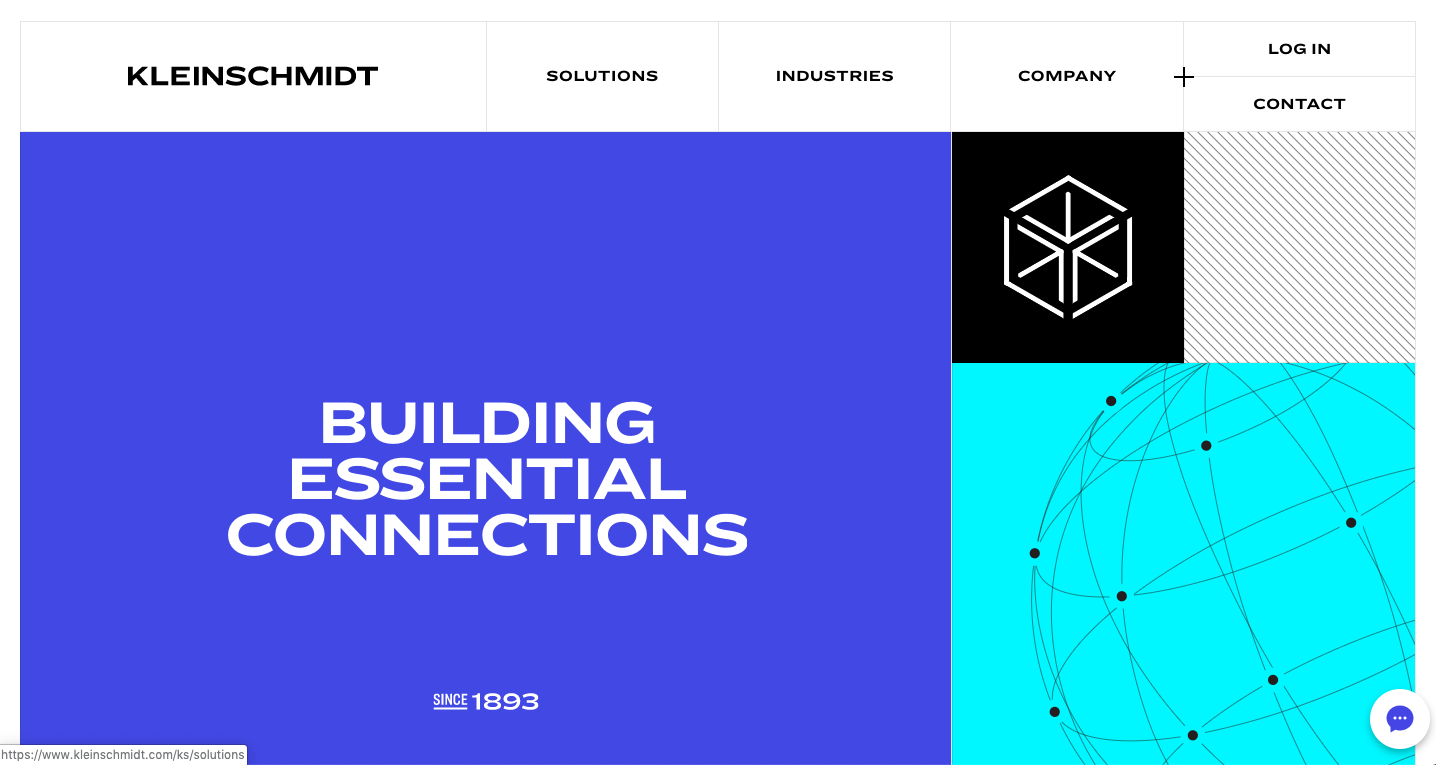
Good Focus States
5. Confusing Hierarchical Structure
Create clear relationships between content that is perceivable and that which can be programmatically determined. Design pages that make sense semantically so developers can translate it from design to code and a screenreader can determine the correct reading sequence.
Tips:
- Semantics: Include required fields and labels on forms. Design tables with column headings.
- Logical Groupings: Group related elements with ample space or background colors. Present information sequentially, such as process diagrams or step-by-step instructions.
- Progressive Disclosure: Design for direct manipulation. Present the right things at the right time. Exercise progressive disclosure.
- Way-finding: Create consistent cues for navigation. Use headings to create clear landmarks within the page.
- Consistency: Present things that are the same in the same way.
- Differentiate: Differentiate different content types.
Bad Hierarchy
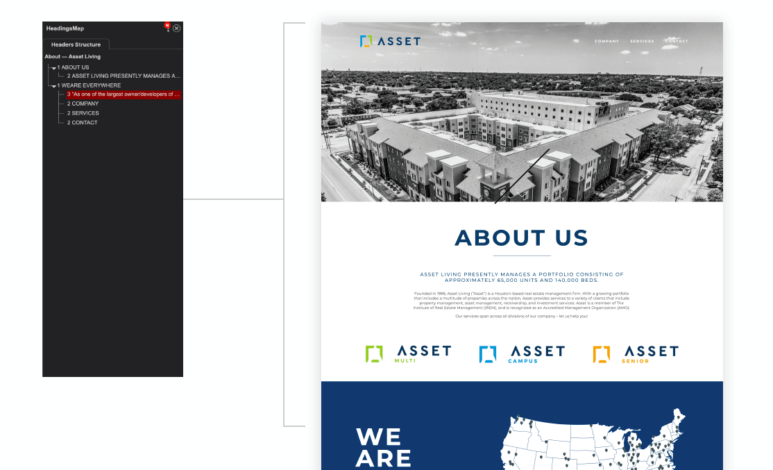
Good Hierarchy
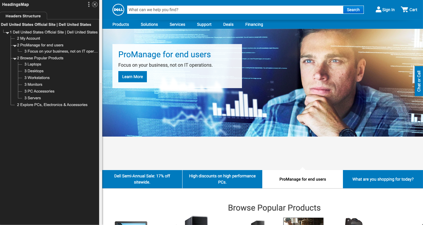
6. Excessive Cognitive Load
Clearly communicate information that it’s easy to understand. Design information in a way that makes it easy to consume for those who live with attention deficit hyperactivity disorder (ADHD), and autism or autism-spectrum disorders.
Tips:
- Be concise: Use short sentences and visual cues to separate information. Ex: list groups using numbers or bullets.
- Minimize cognitive load: Create a narrative that presents information in the right place at the right time. Avoid presenting dense paragraphs of information that can be broken up. Avoid long line measures.
7. Undifferentiated Hyperlinks
Links are one of the most common elements on the web, and are often vital to navigate websites. Links should look like links, and nothing else should. Users may get frustrated if they try to click on textual phrases or graphics that look like links but are not. Links should make sense out of context.
Tips:
- Get specific: Use descriptive words for buttons instead of vague terminology so the outcome is predictable.
- Non-underlined links: The link text must have a 3:1 contrast ratio from the surrounding non-link text.
- Do not rely on color alone: The link must present a "non-color designator” on both mouse hover and keyboard focus. Ex: drop shadows, scale, transitions/ transforms, color changes, or underlining.
Bad Hyperlinks
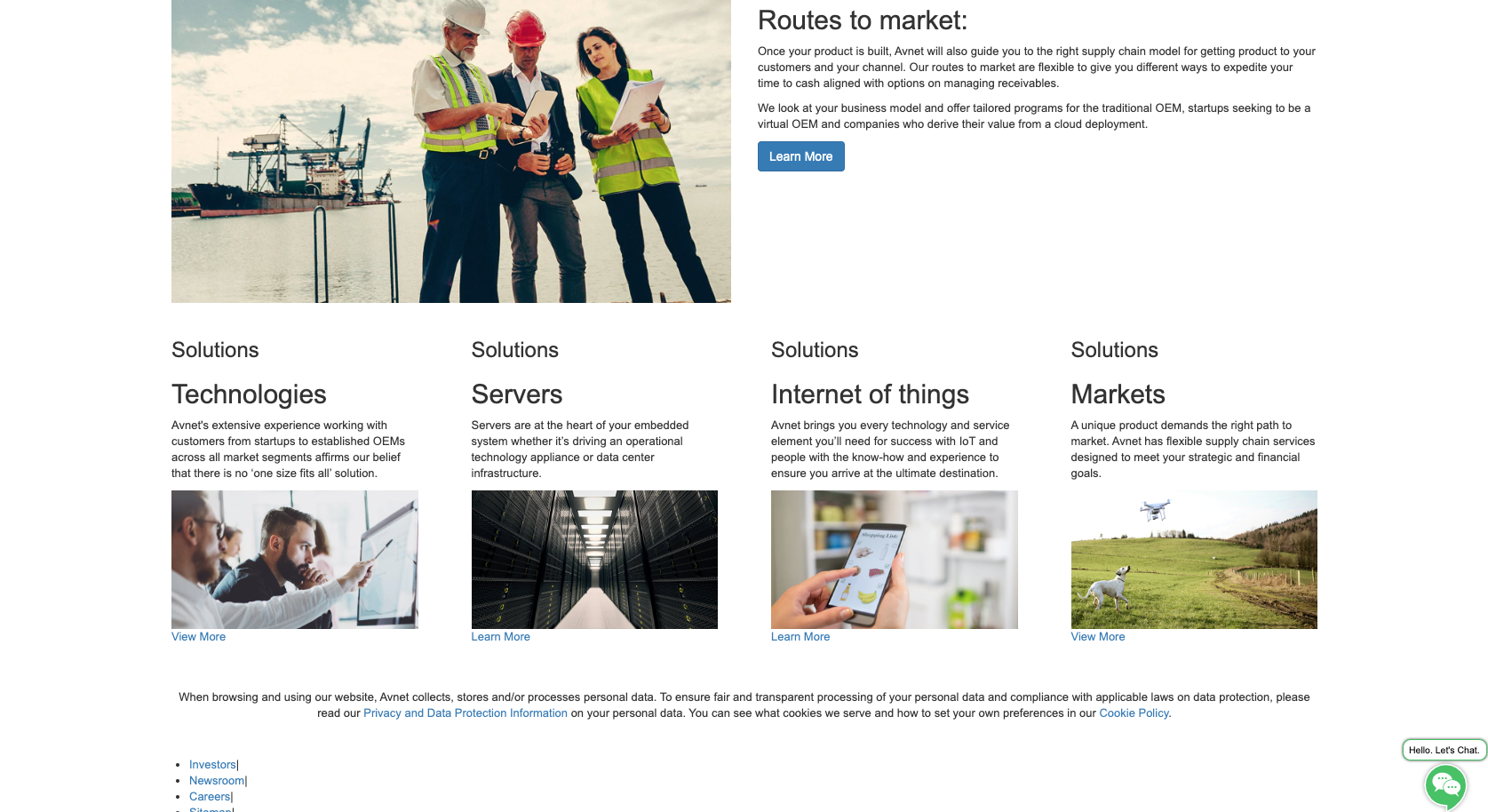
Good Hyperlinks
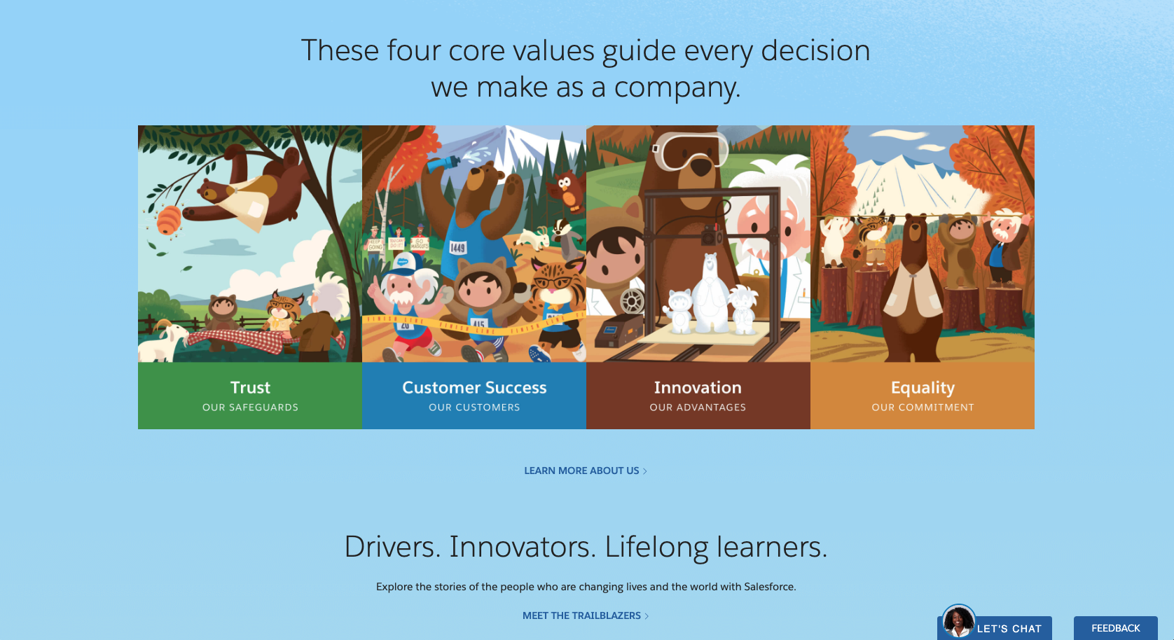
8. Illegible Typography
Most information on websites is communicated through text, so type should be legible and readable. This helps people with low vision easily make out characters. It can reduce the strain of reading for someone with a learning disability. Use clean, simple typography with good spacing. Apply comfortable kerning and leading to ensure text is easily read.
Tips
- Give users control: Don’t prevent users from tailoring their own reading experience by changing the body copy size to a smaller font size. You can do this by setting the font size to 100%, and use relative sizes to establish hierarchy between headlines. Text should still be legible at 200%.
- Reduce underlines, italics, and capitals: These letterforms are more difficult to recognize and read.
- Align long-format text to the left: Make consistent layouts with linear paths for the eye to follow.
Zoom at 100%

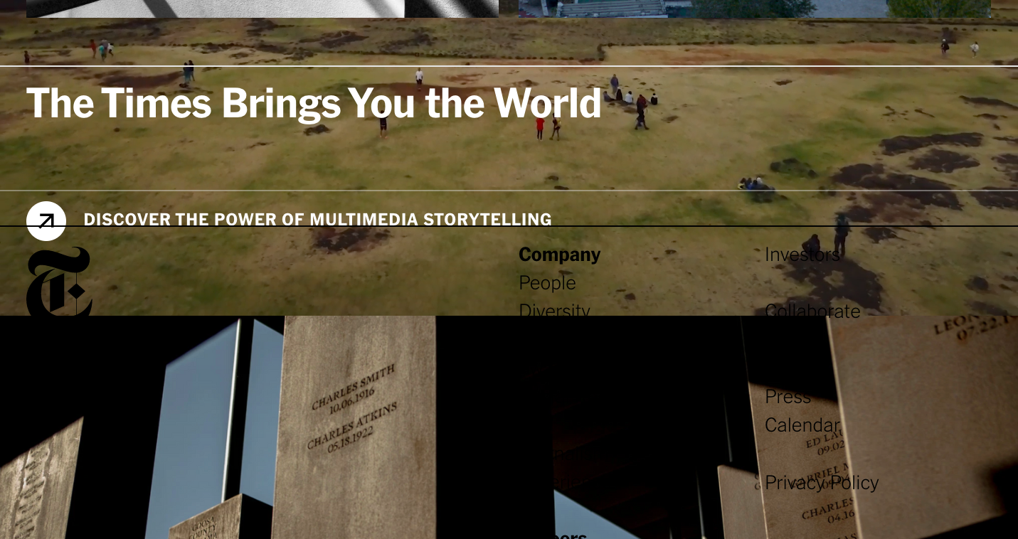
Resize your text. Check that your page(s) is accessible and usable for visually impaired users and users with low vision. Resize text and make sure everything on the page works. Repeat until you get to 200% zoom. Seems simple? It is.
Steps to check your typography:
- Open your browser and resize the text to 200 percent. Click View, select Zoom, and then click either Zoom In (Ctrl/Cmd ++) to enlarge the text size.
- Take a look at how the content on the screen responded. All content on the page should still be readable and no functionality should be lost.
- Check to see if interactions still work, if the text is overlapping, if the important text has been truncated, or if the text has been cut off.
Zoom at 200%
Tips:
- Open your browser and resize the text to 200 percent. Click View, select Zoom, and then click either Zoom In (Ctrl/Cmd ++) to enlarge the text size.
- Take a look at how the content on the screen responded. All content on the page should still be readable and no functionality should be lost.
- Check to see if interactions still work, if text is overlapping, if important text has been truncated, or if text has been cut off.
Resources
Roughly one-in-eight people in the United States has a disability. If the definition is expanded to include those who are moderately impaired, that number jumps to nearly one-in-five.
Failure to accommodate such a large audience limits the positive impact a website can have on your business – not to mention your brand's ability to resonate with people and inspire belief. Building an accessible website that is usable in as many browsers and by as many people as possible can help your business – but it's also simply the right thing to do. So we've put together a few other resources on the topic.
- Find out why it's important for businesses to consider web accessibility (and avoid a corporate lawsuit).
- Tune in to the Solving for B° Podcast about the importance of web accessibility.
