
In September of 2022, the W3C announced that the next version of the WCAG had reached candidate recommendation status. Barring any eleventh-hour changes, version 2.2 of the standard should be ratified soon. The changes are relatively minor, but anyone responsible for a website's construction or maintenance should know what's coming.
If you're already familiar with the WCAG, you can skip the overview and jump right to the nerdy details, otherwise, read on.
What are the WCAG, and Why Do They Matter?
The Web Content Accessibility Guidelines (WCAG) comprise a set of criteria designed to help web developers, designers and content administrators ensure their websites are accessible to people with a wide range of disabilities. The W3C's Web Accessibility Initiative team is responsible for the standard. The W3C and WAI comprise a consortium of industry leaders and subject matter experts focused on making the web more accessible.
The WCAG is organized under four principles of accessibility. Those principles state that a website must be perceivable, operable, understandable and robust. Within each of these principles are guidelines that describe basic goals. Within each guideline are success criteria that describe a specific, measurable goal that website developers should meet to be WCAG conformant.
The success criteria each have a conformance level indicator of A, AA or AAA. Level A criteria are more easily met, whereas AAA is the most stringent.
Will I Get Sued if my Website is Not WCAG 2.2 AA Compliant?
The definitive answer is "maybe."
In the U.S., the laws are ambiguous, and the ADA doesn't explicitly address websites. While there are very specific laws about the accommodations that must be made in a physical space, the only thing the ADA says that can be applied directly to websites is that a company's "facilities must be accessible." Even then, not all courts agree on whether a website counts as a company's facility and nowhere is there a clear definition of "accessible." Note that we are speaking about the websites of private companies and federal laws. For federal and some state government websites, there are laws that apply.
Because there is no clear definition of "accessible," we look to the WCAG to tell us what to do when building or maintaining a website. No U.S. laws specifically recommend any version of the WCAG (or any other standard) for public websites. However, striving to meet any version of the WCAG success criteria is a good goal. It should lead to a site that is reasonably accessible for all.
How are Standards Developed?
Contrary to popular belief, standards development is not performed in an ivory tower by a select handful of participants. While much of the work is performed by employees of member organizations, a large part of the work comes from invited experts and other individuals who are passionate about the topic and are willing to put in the time. Further, many standards teams have open public forums where members of the community at large are encouraged to participate by asking questions or raising new issues.
For the WCAG, the public can read about and comment on standards by opening a new issue, a pull request, or by just participating in the existing discussions at the WCAG repository on Github. When coming to the group with an idea, it is always wise to search all the existing issues and pull requests to ensure your idea hasn't already been brought to the table. If you are thinking of contributing to the WCAG with a pull request, always take the time to open an issue and discuss your idea first. There is a very good chance that you may save yourself some unnecessary work.
Contributing to standards can be frustrating and difficult, but it's also very rewarding. For the most part, participants are very welcoming and patient. If you take time to research your ideas, do your due diligence, and are polite and respectful of others, then your contributions will be welcome. The worst possible outcome is that you will become more familiar with the subject matter than you had ever thought possible.
What's Changing?
One existing success criterion has changed in WCAG 2.2, and nine brand new success criteria have been added. Here we will restrict ourselves to just Levels A and AA since we rarely target AAA. To see all the new criteria, check out the full article from the W3C,
2.4.7 Focus Visible (A)
This criterion has changed from Level AA to A, which is the lowest bar for WCAG conformance. Part of the reason it exists is that, in the not-so-distant past, it was a common practice for people who built websites to remove focus rings. After all, they were not part of the design. This meant that users who were navigating a web page with their keyboard could not see where they were on a page. It makes sense that this criterion is moved to single-A because such a large number of users depend on keyboard navigation, even those without any form of impairment.
All major web browsers will display focus rings by default. The key requirement here is not to break the built-in functionality.
W3C – Understanding Focus Visible
2.4.11 Focus Appearance (AA)
This new criterion defines some clarifying rules about the visibility of focus rings. They must have a 3:1 contrast ratio with surrounding pixels and the pixels they replace. They also must either enclose the element or sub-component that is focused or be as large as a 4-pixel thick line along the element's shortest edge.


Again, the browser's default focus rings will usually meet this criterion. Since users are accustomed to the defaults, you should only override those if necessary. One example might be if there is insufficient color contrast between the default focus ring and your brand's primary color. Browsers typically default to blue focus rings, so if you have blue in your brand's palette, there may be a conflict.
W3C – Understanding Focus Appearance
2.4.12 Focus Not Obscured (Minimum) (AA)
This criterion states that focus must not be completely obscured by user-generated content. This is meant to prevent layered content, such as sticky navigation (a menu bar that stays at the top of the window while the user scrolls), from covering up focus indicators.
The easiest fix here is to simply not have any sticky elements. However, modern websites make liberal use of sticky navigation and floating CTA's, so that is likely not an option. There is some expectation that the scroll-padding and scroll-margin CSS properties will someday allow us to define an offset that will accommodate sticky nav. For now, those properties are used exclusively on elements that leverage scroll snap.
That leaves us with JavaScript. Generally, our goal is to only use JavaScript in the browser when necessary. This StickyFix function will monitor focusable elements inside the main element, and if they are obscured by sticky navigation when they gain focus, they will be scrolled into view.
To use this function, simply include it in your site's JavaScript files.
/**
 * A minimal function that will detect if a focusable element is obscured by sticky navigation
 * This only works for sticky elements at the top of the page, but could be extended
 * @author Donovan Buck <[email protected]>
 * @param {string} selector - A valid CSS selector string for the sticky element
 * @param {number} offset - An additional offset for the focused element
 *
 * @see https://developer.mozilla.org/en-US/docs/Web/CSS/CSS_Selectors
 * @tutorial https://www.brandextract.com/Insights/Articles/Changes-to-the-Web-Content-Accessibility-Guidelines/
 * @license MIT
 */
function stickyFix(selector, offset = 0) {

  // Find the height of our sticky element
  const sticky = document.querySelector(selector);
  let stickyRect = sticky.getBoundingClientRect();
  let stickyHeight = stickyRect.bottom - stickyRect.top;

  // Select all the focusable elements within the main element
  const focusables = document.querySelectorAll('main button:not([disabled]), main [href], main input:not([disabled]), main select:not([disabled]), main textarea:not([disabled]), main [tabindex]:not([tabindex="-1"]):not([disabled]), main details:not([disabled]), main summary:not(:disabled)'
);

  // Add a listener to each focusable element
  focusables.forEach(focusable => {
    focusable.addEventListener('focus', (event) => {
      const targetRect = event.target.getBoundingClientRect();
      if(targetRect.top < stickyHeight + offset) {
        window.scrollTo({
          top: targetRect.top + window.scrollY - stickyHeight - offset
        });
      }
    });
  });
};
You can then call the function:
// Wait for the document to load
document.addEventListener("DOMContentLoaded", function() {
  stickyFix('.sticky', 24);
});
Understanding Focus Not Obscured (Minimum)
2.5.7 Dragging Movements (AA)
This criterion states that if dragging movements are part of the user interface, then an alternative method must be provided that allows for simple point-and-click actions. An example of this might be a form that allows users to drag and drop files from their computer into the browser for upload. You must ensure that a user can also use their file upload dialog to choose which files should be uploaded. Dragging movements are generally not necessary in most website UIs, with this one exception.
Understanding Dragging Movements
2.5.8 Target Size (Minimum) (AA)
Any pointer target must be a minimum of 24 x 24 pixels unless that target is at least 24 pixels away from every adjacent target or the target is in a sentence or block of text. When checking a design for this criteria, be very careful to check social sharing links that use only icons and all your navigation lists.
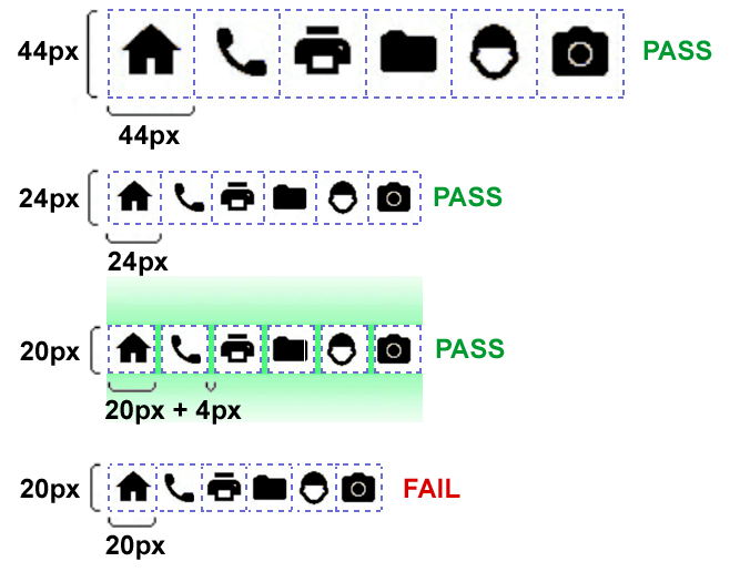
Understanding Target Size (Minimum)
3.2.6 Consistent Help (A)
Suppose your website contains contact details, a self-help option, or any contact mechanism that appears on multiple pages. In that case, those elements should appear in the same order relative to other page content throughout your site. This is largely a function of good, consistent design, and this criterion should not be difficult to meet.
3.3.7 Accessible Authentication (AA)
Forcing a user to remember a username and password can create an undue burden for persons with cognitive disabilities. Because of this, web developers should never create a log-in process that disallows the use of password managers or copy and paste. This criterion allows for alternative authentication methods, as long as they do not depend on a cognitive function test such as remembering a password or solving a puzzle.
Understanding Accessible Authentication
3.3.9 Redundant Entry (A)
This criterion states that any information previously entered by the user during the same process will be auto-populated or available to the user to select rather than having to re-enter the information manually. Obviously, this should be an expected convenience for anyone.
References