
One of the best indicators of a strong brand experience is when customers keep coming back for more. But to earn those repeat customers, brands have to facilitate a positive experience whenever possible. A user experience, or UX, directly affects the satisfaction and loyalty of customers and can influence your brand’s strength in the long term.
In a highly competitive digital marketplace, it’s harder than ever to stand out – but individual user experiences can be key differentiators that show customers how you have their needs top of mind. Use these top five UX tips to help set your website, app or program—and in turn, your brand—apart in 2023.
Tip #1: Use Usability Testing to Improve Functionality

Usability testing is a key method to understand how users are interacting with your product. No matter how you predict users will use your website or app, usability testing can show you exactly how they use it, sometimes in real-time, which can point out crucial adjustments needed to make it functional and helpful to your customers.
Usability tests take many different forms depending on your needs and capabilities. They could be moderated, meaning the user has someone to give them specific instructions to find information or complete a task. The moderator takes notes about how easily the user was able to follow instructions, which can be used to draw conclusions about the usability of the website or app.
Analysis from a usability test could help answer the following questions about your product:
- Where did my audience expect something to be?
- How quickly could they find what they needed?
- Does my site or app have serious friction points?
- Are there patterns in the problems that testers are finding?
The good news is that it doesn’t take many tests to be able to draw extremely helpful findings. A study by the Nielsen Norman Group found that tests only need around five users to find more than 75% of usability problems. After that, each additional user provides diminishing returns on average. If you have the budget to test with 15 people, you’ll get a better return on your investment if you do 3 iterative studies with 5 users each than if you tested with all 15 at once.
To learn more about usability testing and how it leads to better websites, read our guide on the topic.
Tip #2: Fight for Every Millisecond
Load times are the first impression your website or app makes when a user begins to interact with it. Even if the rest of your site’s user experience is refined to perfection, it won’t matter if it takes too long to show it to them.
In a 2006 study by Amazon, they found that every 0.1 second delay in page loading cost them around 1% in sales. At that time, 1% of Amazon’s annual revenue was around $107 million. Today, that number would be $3.9 billion each year.
That means it’s not enough just to give users what they’re looking for. You also have to give it to them fast. Otherwise, they may quickly decide to visit another website that can solve their problem much faster.
According to HubSpot, the first five seconds of page load time have the highest impact on conversion rates. Those rates drop by an average of 4.42% each second, meaning that just a five-second delay can cost you 22.1% in conversions.
For these reasons, it’s important to involve developers early into the design process so that they can help ensure quicker load times and keep users on the page. User experience spans the visual design as well as the performance of the website or app, so make sure the two are working in tandem to help customers find what they need easily and quickly.
A user’s first impression of your website may also be their first impression of your brand as a whole. A speedy website will communicate a much stronger brand than one that keeps customers waiting.
Tip #3: Make it Easy for Users to Make Decisions

According to Hick’s Law, the time to make a decision increases with the number and complexity of choices. That means that throwing all possible information at a user at once isn’t helpful; it only hinders their ability to find what they’re looking for.
A good user experience requires research into the main functions that will be the most helpful for people visiting your website or app. Once you know why people are coming to your site, you can design it accordingly to make it easier for them to make the choices they need.
The idea behind Hick’s Law can be summarized with the acronym K.I.S.S.: Keep it Short and Simple. Emphasize a few key functions to expedite users’ decision-making rather than giving them every option from the jump.
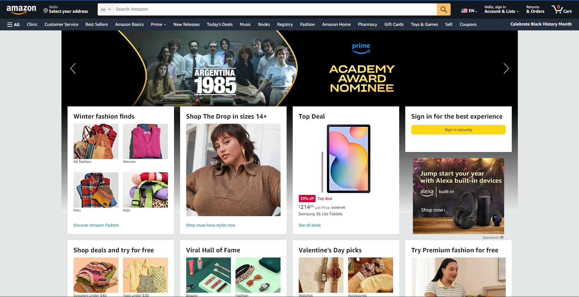
A quick look at the Amazon home page shows Hick’s Law in action: a massive search bar at the top of the screen makes it easy to start searching for exactly what you want. The menu right underneath the search bar allows you to quickly browse by a few major categories rather than showing every possible option.
Keep in mind that the goal is to simplify the decision-making process, but not eliminate it. Use insights gained from your user research to know which choices they need to make, but don’t get rid of their choices altogether.
Keeping the design of your site or app simple and intuitive helps ensure that they can navigate it with ease. This will make it easier to interact with your brand, leading to a higher chance that they come back in the future. Design with informed focus to earn repeat customers who enjoy working with you.
Tip #4: Use the Squint Test
When navigating a website or app, there’s nothing more frustrating than repeatedly clicking on the wrong link, especially when it’s due to poor or confusing design. When elements of a page are too cramped, disorganized, or overwhelming, it quickly becomes a chore to navigate them efficiently. That’s where the squint test can help.
The squint test is a quick, gut-punch test to help determine whether a page is coherent in its visual design. You can perform it by literally squinting at a page (or by blurring a screenshot of a page) and analyzing which elements stand out the most.
Those elements are what the user’s eyes will be drawn to naturally. From there, you can try to determine whether the design is emphasizing the right parts of the page, and whether it facilitates a streamlined experience for the user.
You can also take a look at groups of elements, and determine whether they’re distinguishable from each other. If they’re too close together, it may be hard to tell what is related and what isn’t.
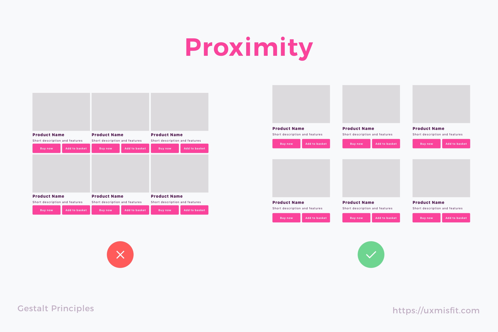
In effect, what the squint test does is quickly test how a page is adhering to Gestalt principles, the elements of visual design that determine how our brains draw meaning from complex stimuli. It can help clarify the visual hierarchy of a page, and determine whether it effectively guides the user’s eye to where it should be.
Tip #5: Be Mindful of Notification Design
We’ve all experienced notification fatigue before—when your phone won’t stop buzzing, beeping, and ringing from the myriad of apps you’ve allowed to send you notifications, it quickly becomes overwhelming. Be thoughtful in the design of your notification architecture to prevent your users from becoming sick of your product.
When a user has signed up to receive notifications, they’re trusting you to help them with timely and useful information. It might seem like an invitation to send them all the information you can, but notifications are only helpful when they provide information the user actually wants.
Provide ways for users to sign up for notifications that are the most relevant to their needs, so that they only receive the ones that help them. Platforms like Slack also cater their notifications based on a user’s status, so that they don’t receive notifications when they set their status to Do Not Disturb:
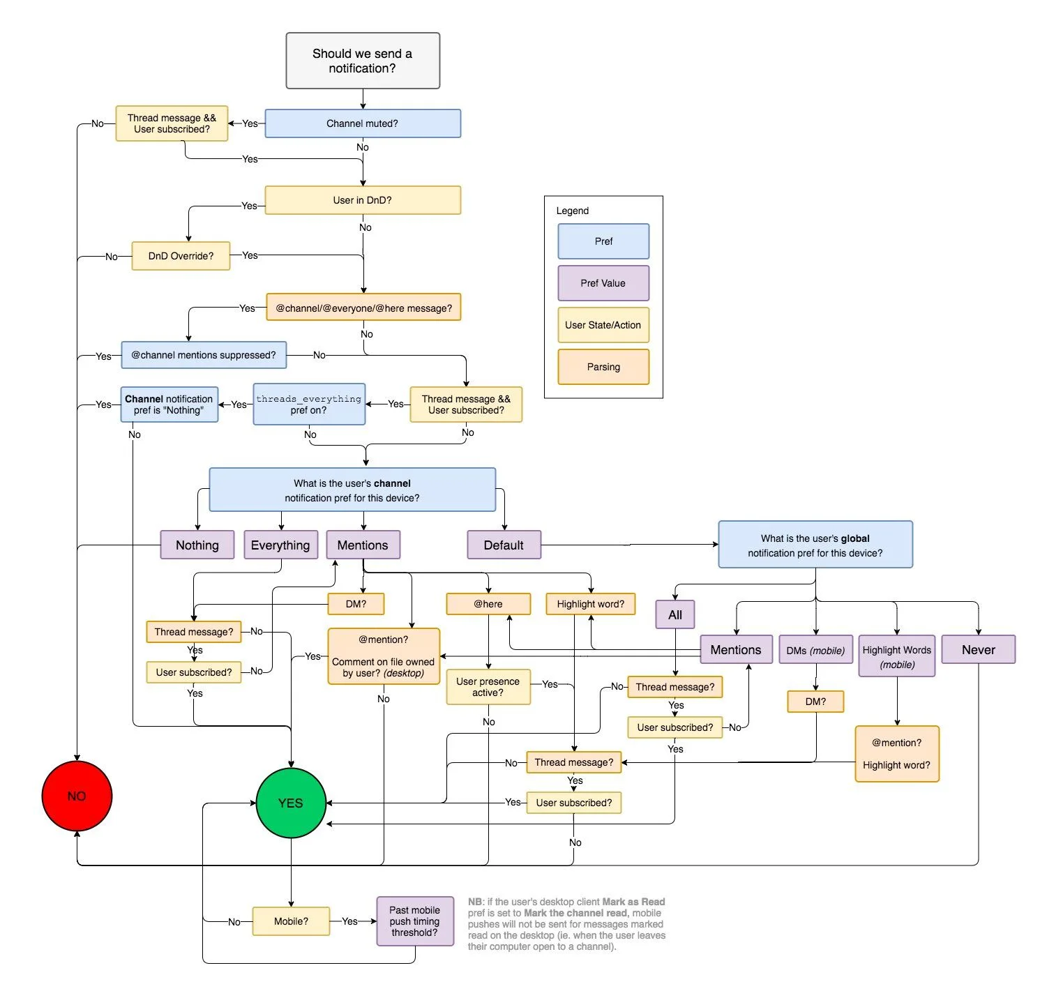
Designing a strong user experience means being mindful of how users want to engage with your app or website, and that mindfulness extends to how you notify them of new information. If it comes across as annoying, overwhelming, or opportunistic, you run the risk of harming your brand and decreasing the user’s trust.
Upgrade your User Experience
Utilize these tips throughout the design process to show customers that you have their needs in mind. If you have any questions about how your user experience can bolster your brand, read our guide on usability and accessibility, or reach out to BrandExtract.