Article
Google's Mobile-Friendly Update and the New Digital Landscape

Google recently rolled out an update for their mobile search algorithm that received a lot of hype and media attention. The changes were dubbed “mobilegeddon,” a term that caused confusion and panic among some business owners reading the coverage, despite Google publicly warning site owners about an impending update. While many site owners focused on the initial impact of the roll out and subsequent mobile ranking adjustments, the nature of the algorithm update has larger implications for the digital landscape and future of your business. Now that the dust has settled, we provide analysis into what Google’s update really means for your business' digital strategy and how to adjust to a mobile-friendly search landscape.
What is the context behind Google’s mobile-friendly update?
In what was called “the biggest shift since the Internet began,” mobile Internet usage surpassed desktop Internet usage in the United States beginning in mid-2014. Now that more people use their mobile devices such as smartphones to engage with web content, Google needed to update its mobile search algorithm to reflect this trend.
As part of its mission to serve the best results to its mobile users, Google will now prioritize sites that offer high-quality user experiences for visitors on mobile devices. Those user experiences are defined according to the presence of elements such as:
- Easily readable content
- Mobile-friendly navigation (Ex: no pinching or zooming to complete simple tasks).
This mobile-friendly update was announced in February and began to roll out on April 21, 2015.
What does mobile search look like now, and how will these changes impact my business?
The Mobile-Friendly Update Explained
Google’s algorithm change will give mobile-friendly pages higher priority in mobile search results. Pages architected and designed only for large screens may see a significant drop in their mobile search rankings, and therefore, organic traffic. This update will not impact tablet or desktop searches.
So what does the mobile landscape look like now? While it's still early (Google has said it could take weeks to complete the full update), experts have reported seeing some significant gains and losses in mobile search visibility for top sites, while other site owners have seen insignificant changes at best.
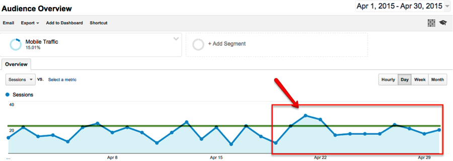
On our own site, we saw not only an initial increase in mobile traffic just after April 21 but an upward trend that's remained consistent since the rollout. We're continuing to monitor mobile traffic trends.

For specific questions about how the algorithm update works, Google provided a detailed FAQ about the changes on its Webmaster blog.
Business Impact
The impact on your business depends on the type of traffic you typically receive — and engage — from organic search. If your company attracts most online business leads from users already familiar with your company, branded search terms could be more valuable for you. If, however, you rely on visits from people previously unfamiliar with your brand to drive significant revenue, you may put more emphasis on unbranded searches as a lead generation strategy. We're currently seeing different types of impact for branded search results and unbranded search results.
Branded Search: Because Google will still attempt to serve the best possible answer to users even if a page is not mobile-friendly, businesses can continue to benefit from owning their brand name, at least in terms of homepage rankings. For example, in a branded search (such as the name of your company,) your website will likely still appear at the top of mobile results, even if your homepage is not optimized for mobile. This is because Google usually recognizes your homepage as the best search result for your brand name. As a result, you may not notice the impact for branded searches right away.
Unbranded Search: Compared to branded searches, this algorithm may have a more significant impact for topic-related searches, at least during the initial rollout. Unbranded searches are crucial for discovery purposes, especially by prospective clients who are already searching for topics relevant to your business. For example, if an executive at a conference hears about a new service or technology they want to incorporate, he or she may conduct a search on their smartphone for potential business partners while they're still at the conference. Your page’s ability to rank highly in a mobile search could determine whether or not you make that executive's shortlist and ultimately win new business. If you depend on this kind of discovery traffic to drive the majority of your business leads, then optimizing for mobile is even more critical for you.
It's important to note that as mobile usage continues to gain ground over desktop usage, and users increasingly utilize these devices within the context of their businesses, even websites that do not currently depend on mobile traffic could begin to see a decline in organic users over time. Even more critical, however, is for your site to provide an optimized experience for mobile users once they do visit your site. Converting interested users into actual customers is what ultimately drives your business, and users today expect a mobile-optimized website experience.
How can I tell if my website is mobile-friendly?
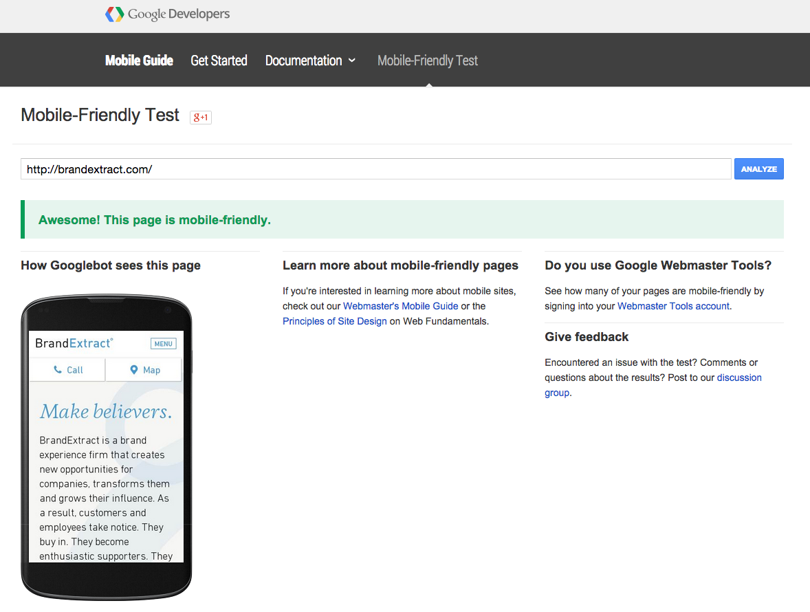
Google began issuing warning emails in February to site owners that were registered in Webmaster Tools. These warnings encouraged site owners to consider their websites' mobile performance. Google evaluates the mobile-friendliness of each individual page, rather than on a site-wide basis. You can continue to use Google’s Mobile-Friendly Test or other free tests to check the status of a specific page, including key pages such as your homepage, About Us, Products or Contact page. 
Google’s Mobile-Friendly test is based on a pass/fail system — your page is either mobile-friendly, or it's not. When it comes to determining position in search rankings, one page with the mobile-friendly distinction will not be considered “more mobile-friendly” than any another page that also passes the mobile-friendly test. Remember that mobile-friendly is just one out of over 200 factors that Google uses to determine ranking.
If the page does not pass the test, the tool will automatically provide specific suggestions for what needs to be fixed or improved, such as:
- Text that is too small to read
- Links that are too close together
- A viewport that is not optimized for a mobile screen (forces users to pinch and zoom)
How should I prioritize my efforts to build a more mobile-friendly site?
Google's update functions on a page-by-page level, which means that it is possible to focus on making improvements to high-priority pages first, like high performing landing pages — you certainly don't want to lose rankings for pages that have historically converted users from organic traffic.
But we caution against cherry-picking the pages on your site that will be mobile-optimized. Navigating through a website and encountering some pages that are mobile-friendly, alongside others that are not, can be a disorienting or frustrating experience for mobile users. And at the very least, your site will look unprofessional if it has an inconsistent design and user experience.
Evaluate Your Site Data
Dive into your website analytics to understand the performance of your site through the behavior of existing mobile users, and begin thinking about how — and when — a full website redesign might be appropriate.
Segment your overall sessions by mobile traffic. We use Google Analytics, but most website reporting tools should have this option. Consider what percentage of your overall traffic comes from mobile devices in the first place and then look at what which pages receive the highest volume of traffic from organic search. If you see a significant amount of traffic at this stage, then you'll want to dig deeper and examine user behavior coming from mobile.
Analyze behavior metrics for mobile traffic. You'll want to evaluate metrics that point to how valuable and user-friendly visitors consider your content, like bounce rate, time spent on page and pages per session. Look at each of these by medium to compare engagement metrics by organic, referral and direct traffic. Page speed is another metric worth looking at, especially if your brand has an international presence. Remember that data speeds can vary based on location and unlimited data plans are not always the norm.
Try to identify patterns for known keywords. Particularly if branded terms drive a significant amount of organic traffic to your site, you can still get a fairly decent understanding of the quality keyword rankings you want to protect or improve. Review Google Webmaster Tools, your top landing pages from organic traffic sources and known keywords listed in Google Analytics, and then look at session trends for the time since April 21st in comparison to the week before to see how the recent change has impacted your online visibility.
Manually review top pages from organic sources. It's very important to look at landing pages as well as users' navigation path to identify the pages that users deem important. This group of pages should make up your core list of pages you need to evaluate for mobile friendliness. Look at them subjectively and also run them through the Google Mobile Friendliness test to get an idea of what investment you'll need for your website redesign.
Prioritize Critical Issues but Start Planning for Redesign
If you start noticing a significant drop in quality traffic to key conversion pages on your site, you'll need to approach those "mission critical" issues first for the sake of protecting your bottom line.
But we strongly recommend planning for your mobile redesign project as early as possible. Whether or not you have fires to put out in the coming months, a long-term, sustainable digital strategy is directly tied to your ability to provide a complete and consistent experience for both desktop and mobile users.
What kind of mobile site redesign do I need?
If you've determined from your site performance analysis that mobile traffic is important to your business, consider how to approach a website redesign. There are multiple possibilities for mobile design, but we usually recommend responsive sites as the best option for our clients.
A responsive design approach will allow your website to respond to desktop and mobile needs without creating separate sites for each. Building a custom responsive website can be a significant investment of time and money to do right, but it's typically the investment that will save (and earn) your business money long-term.
Long-term mobile strategies:
Even if your existing customers are primarily using desktop devices right now or your mobile users arrive on your site predominantly via branded searches, remember that mobile usage has surpassed desktop usage in the United States and continues to grow. Your desktop acquisition rates may shift over time to reflect this trend, and mobile users could become increasingly important to achieving your revenue goals.
The most important thing to remember is that users need a mobile-optimized experience if you expect them to engage with your site in any meaningful — and profitable — way. But also plan to supplement on-site efforts to become more mobile friendly by exploring ways to promote your site to targeted users so that you can more aggressively increase quality mobile and organic traffic.
If you'd like to discuss how the impact has affected your own traffic or how to position your company to be a dominant player in today's digital landscape, we'd love to start a conversation.
Further Reading:
Google's Mobile-Friendly Websites "Get Started" Guide
Building Your Mobile-Friendly Site: The Distilled Best Practice Guide
Moz's Mobile Optimization Guide and SEO Best Practices
