Article
7 Usability Mistakes That Are Hurting Your Brand
Usability is one of the most important factors in the success of a website. But it often goes overlooked. Time and time again, we've seen companies violate usability best practices.
It hurts your brand and it hurts your bottom line, 100% of the time.
In this article, we break down seven of the most common mistakes so you'll know what to look for and can build goodwill with your users instead of losing it.
We sit down with Jason Wolter (Information Architect) and Cynthia Stipeche (Director of Brand Experience) to walk through these seven mistakes and how each affects your brand.
- Mistake #1: The 'Hamburger Menu'
- Mistake #2: Not Using Home Links
- Mistake #3: No Search Function
- Mistake #4: Rotating Carousels
- Mistake #5: Autoplay Videos
- Mistake #6: Two-Column Forms
- Mistake #7: Placeholder Text
Mistake #1: The 'Hamburger' Menu 🍔
Jason: Let's start with the big guns. So the biggest one is probably the hamburger menu. People use the hamburger menu quite a bit but it has a very low discoverability rate. People don't always see the menu, especially when it's the three bars.
The three bars often aren't recognized. In the business that we're in, it's kind of second nature to us to use a hamburger menu. But in field testing, people don't know what those three bars represent. It hides the menu to a low discoverability to the better option.
Hey @Tesco the menu on your leaflet seems to be broken.
You’re welcome 👍🏼👍🏼🤓 pic.twitter.com/7X7l6WRLND
If you have to use a hamburger menu (for example, when viewing on a mobile device), the best practice is to use a button that says 'Menu' with an outline around it to clearly indicate it's a clickable button. But it's no replacement for visible navigation. Ideally, that is really the way you want to go.
A lot of agencies use it because it's cleaner. But it's hard for people to see. Usability is about making things frictionless and making things easy for users to interact with. And if users have to learn how to use your website in order to interact with it, what's the likelihood they're going to come back?
It's called cognitive load. You go in with a blank slate, but the more difficult it is for someone to find something, or the more you make them wait on some information, the more likely they are to end up abandoning you. The solution is to create a simpler solution that works for them.
It's one of the top usability mistakes; the hamburger menu must go!
Please please please 🙏🏻
If you need a hamburger menu, put the close button in the same place as the menu button. pic.twitter.com/5DxBQKQH9b
Cynthia: I will put a little bit of context to this. A lot of people don’t recognize the hamburger menu and testing is proving that. But at the same time, it will depend on a company’s audience.
For example, if it’s an entertainment or gaming site and the audience skews much younger, they will likely know exactly what those three lines mean. There are best practices from testing but often it’s a diversity of ages. If your business has a lot of younger customers they’re going to know exactly what that is. At the moment, especially if you're doing a B2B site, you probably shouldn't lean on that hamburger menu.
Target audiences and personas matter. If you have a website that just caters to everybody, it’s a big mistake. Users will be overwhelmed with no context and no information that caters to them. You need to define the purpose of every page. If it’s not defined, then it's not structured correctly. And if it's not structured correctly, it won’t function properly.
When you develop personas and they’re not based in research, you can end up designing a site that fails your audience. Observing the end user, talking to the end user, talking to the customer is so key for usability and managing your brand through your website. And we do that. We do a lot of voice of the customer studies to better understand our target audience and their pain points.
If you're going to develop empathy for your target audience it should be rooted in real people. It should be rooted in observation and not in assumptions.
Mistake #2: Not Using Home Links 🏠
Jason: A lot of websites rely on people knowing that if you click the logo in the top left or wherever the brand logo is that will always take you back to the home page.
Testing shows that's not the case.
A lot of people don't realize that you're able to navigate that way. So what people end up doing is clicking the back button in their browser to try to get back to the homepage. So having a persistent link on internal pages creates a clear way for users to get back to that homepage. And a lot of people ignore that.
Cynthia: Sometimes we want to clearly bring in a button that says ‘Home’ again on internal pages. I think that goes back to generational differences. A younger audience will likely expect that if I click on the logo, it will take me home. But right now, the testing shows that it’s not a best practice to have the logo as the only way to navigate back to the homepage.
Mistake #3: No Search Function 🕵️♀️
Jason: Search is another thing. There is a subset of users that navigate websites through search. So if you don't have a search option or if you're not emphasizing your search option with either an exposed search bar or a search button that stands out from your navigation, you're alienating a particular audience. It is especially important on large sites with a deep architecture. A study by Search Engine Journal found that close to one-third of users say they’re put off by no search box on a website. More than 40% say a search box is the most important feature on a website.
The bare minimum should be an icon that is visually distinctive from your navigation. There's a test where you squint your eyes and stare at the middle of the screen. Your vision becomes blurry and you look for items which stick out that you can visually identify. If you can see that search icon sticking out from the navigation text, then that's passable. But the best thing you can do would be to have an exposed search bar so that it's clear where to start your query.
Cynthia: My other issue is when you offer search on your site and then you don't give people a way to filter search results. Or even if you do have a search function, the resulting page lacks the ability to filter by file type for example. It creates more friction for the user as they’re trying to locate information.
Another mistake with search function on sites is the inability to search again on the results page. We’ve done testing in the past and discovered that a lot of people who skew younger didn't use the main menu to search the site or to find content. They went straight to the search function.
They don’t mess with the navigation and go straight to search. For a generation brought up to find information via search engines like Google, if your search feature doesn’t work on your website, you're going to lose them.
Mistake #4: Rotating Carousels 🎠
Jason: Auto rotating carousels - or carousels in general - aren't very effective. People generally will scroll past them. So if you're just scanning a page, a marquee might have four key messages, but most people are only going to see that first one, because they're just going to scroll down to content.
An auto carousel is worse. Depending on what content you have in there, the users don't really have control over the message that they're seeing. So they might be interested in one of your key messages and then it slides off before they're able to consume it all. Or they may have seen it and want to come back to it. Then they scroll back up and it's not there and they have to click and go find it.
So you're making them do work. Which goes back to cognitive load. And then once they find that message that they're looking for, they're on it for five seconds and then it switches again. They've got to click it to go back. That's just a whole mess.
For example, if you have five testimonial slides, 95% of your users are just going to see that first one. They're not going to click in and try to view them all. But that's not a super high priority so in some instances that is acceptable.
Where it's really bad is in your marquee where you have three or four main messages and a CTA. These are key messages you're really trying to push and people never see them. It's okay if they don't see three of your four testimonials, but it's bad if a rotating carousel makes a user miss key messaging.
Cynthia: Typically we avoid carousels like the plague but a lot of companies still use them. It especially doesn't make sense in a marquee because the user may miss a vital piece of information. It would probably be better if you don't hide important pieces of content, even if it’s at the top of the page.
Some people want to cram everything at the top of the page and that's all they're thinking about. But if information is hidden in the marquee, it's not doing anything for you.
Mistake #5: Autoplay Videos 🎬
Jason: A lot of websites like to use movement in their marquees. There might be a video and when they land on the page, the video starts playing. Some people don't like that. They don't like the movement and they don't want to see the video.
To get around this you want to include a pause button. You want to have something that gives the user the ability to shut it down if they don't want to see it. The better practice probably would be to have an image back there and really emphasize a play button to give the user the option: "Do I want to see this video or not?" You're not just pushing it on them and making them view it.
How to annoy your website visitors
1. Autoplay video/audio
2. Stupid notification
3. Takes forever to load the site
4. Pop-ups
5. The website doesn't load if JavaScript blocked
6. Not ready for mobile devices
7. Too many ads
Anything else am I missing?
Even autoplay videos in other areas on a site can interrupt the flow of the user looking for information. So it's generally not a good idea ever to autoplay anything.
Cynthia: Autoplay videos are awful. It's a jarring experience. You don't want to visit a website and have a video start automatically. It would be bad to play a video with a volume off. Even worse would be with the volume on. If you want to convince people to just avoid your website like the plague, go ahead and drop in an autoplay video.
Now if you do have a piece of strong video content, I would probably grab a segment of that video and create a passive loop. Then it’s not so in your face and prominent. It could play in a loop of three seconds or so and include a call-to-action to watch the whole video. Then it’s not jarring or throwing you off. At that point it's just enough to entice the user to say, “I'm interested in learning more about this.” You give them the option so when the audio comes on and the video starts playing, they’re not surprised. The user should be in control at all times. People often don't think about that.
We need to have empathy for the user. So what does that mean? A business is going to have its own goals. But that can’t get in the way of what the end users themselves need. A key question is “How do I best serve up what I'm offering within the framework of their experience? So when you have empathy for your end user, invite them to visit the site and to learn about it. And support them as they dive in to learn more.
At that point there's a sense of goodwill. If you approach your website by trying to do what's best for the user versus doing what's directly best for your bottom line will pay dividends in the long run.
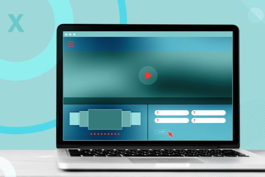
Mistake #6: Two-Column Forms 👨💻
Jason: Having fields in a vertical line instead of fields left and right down a page is much more usable. People are used to tabbing through something and they expect to move down the page. If you have two columns, there are too many different tabbing patterns. They don't know if it's going down. They don't know if it's going to the right. There's an expectation of what should happen and that's to move down. So you're not always fulfilling that expectation when you have multiple columns. So it's good to have a single column so people just move down the form.

Mistake #7: Placeholder Text as Labels 🔤
Jason: You don't want to use placeholder text for labels. Placeholders are there to show a user an example of the content that the field requires.
🙅♀️🙅♀️🙅♀️
Don't use placeholder text in lieu of a label!
15 million people in the US in 2016 self-identified as having cognitive disabilities. If the user starts typing they may not be able to complete their task as the placeholder disappears.
Recognition > Recall! pic.twitter.com/Pe7k6gYPLF
So you want your labels outside of that field. If they're inside as a placeholder, when you click in it, the text disappears. If you get off task, you may come back and you won't be sure what field you are filling out.

This also impacts accessibility with screen readers. Labels tell a user with a screen reader, what that content should be. If the label is a placeholder and not included as external instructions, it can confuse people with screen readers.
The Biggest Mistake: Aesthetics Over Functionality
Never prioritize aesthetics over functionality or vice versa. You want to have a good mix of both. If you're contemplating implementing a design trend, make sure it makes sense for your site and you're using it for the right reason. A design element might look really cool but it's impractical for most users. So you want to make sure that things are functional.
Your brand is your reputation. If your website is difficult to use, you’re likely to irreparably damage it.
Join our mailing list
Meet the Authors