What’s the power of a brand? Looking back over our past decade of work, we have truly witnessed the impact of branding on social good. It has been our privilege to work with several transformative non-profit organizations that help people through challenging situations and provide vision and context for the future. Our goal is always to help our clients thrive, and we are honored to play a part in helping our community thrive, too.
As we approach a landmark company anniversary, we invite you to reflect with us on memorable branding projects from the past ten years. In this edition, we highlight non-profit projects where we were able to provide a fresh, confident perspective for a remarkable group of organizations that do the same for others.
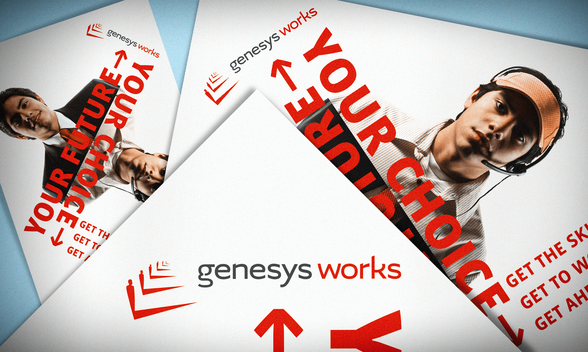
Genesys Works
Genesys Works breaks down obstacles for inner-city high school students. The organization provides intensive summer courses on professionalism and business skills to help students succeed in the workplace. The non-profit then connects them with corporate internship opportunities to gain valuable professional experience. Originally called Genesys ITS, the organization approached us in search of a new identity that would better reflect the spirit of their growing program.
Logo Elements
We developed a logo symbolic of the students’ rising careers and bright futures. Will Cunningham, one of our Associate Creative Directors, believes that well-made logos often allow for more than one interpretation, and the design for Genesys Works invokes multiple meanings.
- From one perspective, the logo appears like a staircase, representative of advancement and moving from one stage of life to the next.
- Another interpretation sees a new day dawning, with the shadows indicating sunrise and hope on the horizon.
- The mark is also somewhat reminiscent of a checkbox, echoing the affirmative quality of their new name.
The non-profit has grown to reach massive, nationwide success, opening several new offices across the country. The organization has even visited the White House to speak in front of President Obama’s Office of Social Innovation.
The updated brand established a professional, empowered persona for the organization, aiding the transition from an ambitious start-up to a thriving foundation. Genesys Works has impacted thousands of young adults, changing the cycle of opportunity.
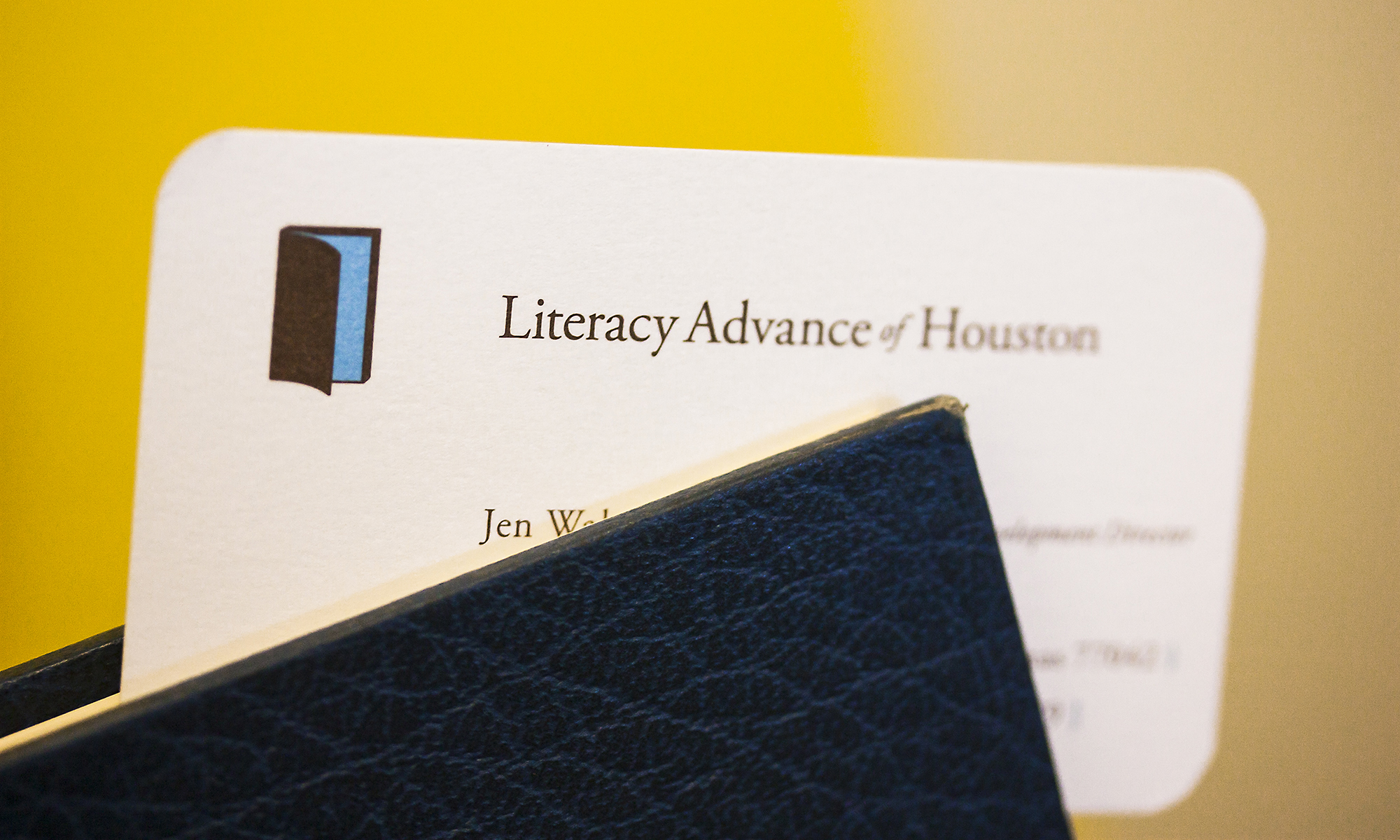
Literacy Advance of Houston
Literary Advance of Houston provides free adult literacy programs to teach individuals how to read, write and speak English. The classes unlock the potential of adults previously limited by language barriers or the lack of fundamental literacy skills.
Logo Elements
- Built on the concept of “transforming lives and communities through the doorway of literacy,” the identity we created not only contains the image of a book to represent their students’ newly acquired skills, but also an open door symbolizing hope.
- As a whole, the logo and the work of the organization represents a new chapter for these adults.
- The blue hue in the logo calls to mind blue skies and boundless opportunity.
- For the primary and secondary color palettes, we selected warm earth tones to represent a global identity. It was important to celebrate the cultural diversity of Literacy Advance’s students, who speak dozens of different languages.
Since developing the new identity package for Literacy Advance of Houston, the organization has grown and expanded its services, increased its volunteer base and number of tutor hours. The refreshed brand materials help the organization provide a more professional experience for volunteers and donors. Our own Chairman, Jonathan Fisher, got so involved with the cause he joined the non-profit as a Board Member and served for six years.
Cristo Rey Jesuit
Cristo Rey Jesuit offers a rigorous college-preparatory education to students from low-income families. Students raise the majority of their own tuition through a unique work-study program that helps students earn placements with businesses and non-profit organizations in the Houston area. The school’s mission is to empower students from economically-challenged backgrounds to reach their full potential.
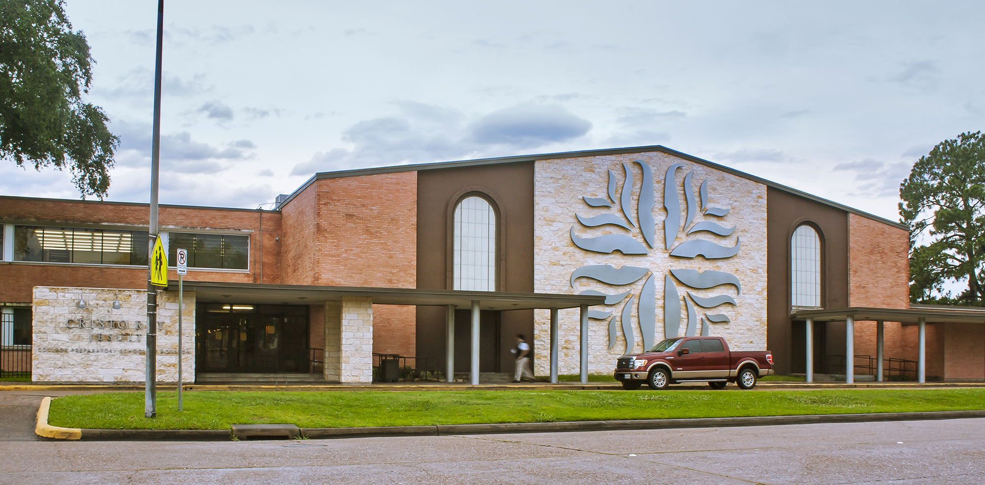
When Father TJ Martinez, the school’s founder, arrived in Houston, he was adamant that the school needed a brand – even before buying real estate or finalizing funding. He knew that a brand would help tell the school’s story and communicate its vision.
Logo Elements
- The school needed an academic and religious identity, but we also wanted to create a logo that looked like a beacon of hope.
- The Jesuit Order possesses special iconography and symbols that our team used to inform the design of the logo
- The logo features a radiating sun, symbolic of the Light of Christ, with the cross at its center to represent His followers.
The identity has grown organically over the years. The logo has manifested in many unique ways, including in welded iron light fixtures at the school and even a wood-carved version that was presented to former First Lady, Laura Bush, on her visit to campus. Perhaps the most impressive use of the logo is the two-story tall version on the side of the building, lit by LED lights and visible as you fly into Hobby Airport. The illuminated logo mirrors what the school has done for the community, becoming a beacon of hope, calm and reason.
Our Next Chapter
We are thankful to be affiliated with the extraordinary organizations creating hope and opportunity in our local communities. The BrandExtract team looks forward to future transformative work in the next decade.
We are excited to look back on even more great brands that we have developed over the years. Visit us again soon for the next installment of our logo design retrospective series.