Podcast
How to Develop a High-Performing Website
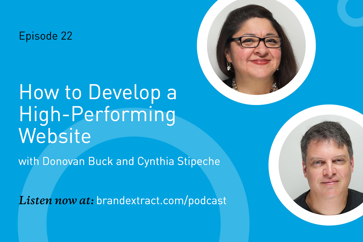


How to Develop a High-Performing Website
In this episode of Solving for B°, our experts discuss the most important elements that form the foundation for high-performance websites. We explore everything from user experience and functionality to design and content.
Read the Transcript
*This transcript has been edited and formatted for readability.
Chris Wilks: Today we're going to discuss the key components of an effective website – why each one is important, and how they all work together. I'm your host, Chris Wilks, and to help break down each of these elements, I'm joined by director of
The Ultimate Purpose of a Website
Chris: Now to start us off, can you tell us what the ultimate goal of any website is?
Cynthia Stipeche: Well, it's communication. It's accurately communicating whatever your client, whomever that is, is trying to express through that site. Let's say it's a cooking magazine. You want to allow your users to arrive on the site, find information easily, quickly and get to the core of what it is they're looking for.
Chris: And that speaks to user experience, right? It's providing the best user experience possible. So minimal friction, most valuable information, easy paths to that information, etc.
Cynthia: Absolutely. There's a lot you can take into consideration, like best practices for developing websites and everything you just mentioned. Minimal friction and making sure you have the hierarchy of the information that you're presenting on the site and making it easier to find.
Another core aspect for developing a great user experience is understanding your target audience and who it is you're speaking to. That goes a little bit beyond just following best practices, really diving into who your target audience is and what types of challenges they might be facing, what they're looking for specifically.
Chris: Yeah, and that's a good point because the optimal user experience is going to depend on your target audience. If you're speaking to, say, middle-aged men, the way that they interact with websites is going to be a little different than the way maybe teenage girls are accessing a website.
Cynthia: Yeah, absolutely. And that's something to always take into consideration when developing a website.
And you bring up a very good point. If you look at a younger age group, well, what are they looking for? What qualifies as something that would create a better experience for them? Maybe it's a highly searchable site, versus a lot of other folks where a robust navigation might make more sense. We might be looking at even design elements – larger fonts, smaller fonts, what works for older eyes. People like me!
The Many Forms of Accesibility
Chris: That's a really good segue because we've now established that optimal user experience is one of the main goals of any website. What I want to talk about now is font sizes and web accessibility.
I want to talk about it because it's topical right now. We're seeing lawsuits happening, frivolous or not. I mean, we can debate that, but accessibility is one of the key components to providing a good user experience. If your site isn't accessible to everyone, then some people are getting left out of that user experience. So Donovan, can you talk a little bit about what accessibility is and why it's important?
Donovan Buck: Sure. Generally speaking, as you summarized, making your site accessible to people who have some form of disability in them. The one we think of most often is
Chris: I am not.
Daren Guillory: I am.
Donovan: Two people here wearing glasses, one's wearing contacts. The majority of the people at this table have a visual impairment. That may not be as severe as some of the ones we need to specifically address, but there's a huge number of people who do have a visual impairment.
Now, our clients are B2C and B2B and a lot of times the decision makers that we're trying to reach, the target audience might be someone over 50 and they're going to have problems reading small fonts and things like that. So, it's not just the extreme cases. It's the minor cases that we need to be considerate of when we're doing our design work and UX work.
Chris: So Daren, whenever you're talking about balancing usability with design, are there sacrifices that have to be made? Is it the case that good design includes accessibility?
Daren: That's correct. From my point of view, they're not mutually exclusive, right? They all contribute to the user experience, but you don't necessarily have one without the other. You can have a beautifully designed website, but it can still be accessible. I think there's this notion in certain circles where, "Well, my fonts are too big. They look horsey, or they look garish, or they're just overt or too large."
And that's not true anymore. We have a vast library of fonts that we can pull from that
Chris: Are there any other marquee examples of a way to creatively make a site accessible?
Cynthia: I think it's a lot of the same things we were talking about. So a lot of this is in the realm of visuals, it is a contrast ratio. It is I would say, in some cases image quality. It just depends on what the site experience is. Now, there's a lot of stuff that goes on at the back end that then ties into the visuals. For example, and Donovan, I'll let you talk about this part where it's like making items on the site accessible, for example, for people who use readers.
Donovan: You're right, the majority of things that we need to do to make a site accessible for a screen reader, don't affect the design. They're tags that we put in at the back end, things that the rest of us who aren't using assistive technologies never even see.
There are some things that the designers do need to worry about. Contrast ratios are really important. It's one that you see violated on a lot of websites out there. And font size is another one of course, for obvious reasons.
Daren: From the design perspective though, you can find a great baseline font which is your lowest point size and still create a great rhythm, a great hierarchy and a great system of typography that is usable, functional and beautiful.
Cynthia: And there's also something to be said for site experience. Every time before we start an engagement, we speak to our client, we try to understand exactly, (1) what their business goals are, and (2) the site goals and objectives. And (3) who their target audience is.
From there, if there's something that comes up, like a very interactive experience that may be difficult to translate into something a screen reader could decipher, we might reconsider some type of a feature on the site. It doesn’t usually get that extreme, but it's something to keep in mind.
What type of experience is going to speak to your end user? It has to make sense. Otherwise, going back to what makes a great website, if it's not working for your target audience, you're missing the boat.
Chris: Right, and you bring up a good point. In an instance where you have this really incredibly designed, incredibly interactive piece that doesn't necessarily translate to, "Oh, this is an image, here's the alt text." How do we treat that?
Cynthia: I think you could still strike a good balance between a rich experience but also make the site accessible to all different types of audiences. One that pops into mind is Snow Fall. It was a very rich, interactive piece developed by the New York Times. The big thing was the way the elements were presented on the page.
Chris: So a little bit more immersive.
Cynthia: Yeah, it's more of this immersive experience. It was like bringing in more of these ambient background looping videos, but that added to the story. It’s about considering things through that type of lens versus back in the day when people were creating these fully interactive sites with no focus on the content.
Daren: Right, so it's changed a little bit. Animate everything was the status quo back then. But now, it's more purposeful and more behavior oriented. We think about our end user, we think about accessibility. If we're designing an element that's interactive, we want to make sure it's tying back to the brand, it's tying back to a purpose. So even the behavior of a button in an interactive state can still be both beautiful and usable.
Chris: Yeah, functional, right? That's where content strategy comes in. This episode is about the elements that make up a strong website and a strong user experience for that website. And
The Role of Visuals in a Website
Chris: Speaking of content strategy and SEO, Donovan mentioned that some of this stuff is on the back end of the website, which someone who's not using a screen reader will never see. But those things actually do affect search engine optimization. The most basic one I can think of is alt text on images. Screen readers use those, but search engine bots will crawl that because a machine can't quite go in there and look at a picture and tell you exactly what it is. They rely on that alt text.
Cynthia: Which is something that, I can imagine there's a number of websites out there in the universe that
Chris: Yeah, it's going to hurt its indexability. It's going to hurt its rankings. It goes back to what we were talking about earlier – if you don't have a site that provides a good user experience. Maybe it's beautifully designed, but it doesn't have a great user experience, it's not going to be found. It's not going to be helpful for your target audience.
Cynthia: And there's nothing worse than somebody coming to a site looking
Chris: Yeah, brilliant visuals can only hold that attention for so long and I'm trying to provoke you over there, Daren.
Daren: No, no, but I think you only have about 10 seconds before someone decides to leave or stay. So certainly little micro-animations and beautiful imagery can maybe entice them to stay, but the web is becoming increasingly task-oriented. It serves a purpose. Users want to get what they want now, so load times and getting to the information quickly is very important and design can still play into that.
Chris: Yeah, I'm glad you brought that up. That stuff is critical to performance, not only from a user standpoint but search engines now, as of, I think it was July or maybe it was June, but very recently Google explicitly stated that their mobile page speed is a ranking factor.
We talked about it at the top of the episode, Google's goal is to provide the best user experience possible. Waiting around for three seconds doesn't seem like a long time, but in terms of web, we're very impatient people. If you're sitting around for three seconds and you don't see anything on your screen, you're going to abandon that ship so to speak.
Daren: Right, and people are increasingly using mobile devices or tablets to do everything. I don't know what the current
Chris: With the advancement of mobile technology and the access that people are getting around the world to it, it's more convenient in some cases. We probably need to do a whole episode on the rise of mobile and that trend.
Cynthia: There's one example that comes to mind. I was looking at Airbnb on my phone, and I was amazed by how quick it was working. The images were downloading quickly – a huge difference from its performance a couple of years ago. They know their business and what they're selling is completely dependent on big images. So you can imagine yourself staying in this home. You need to see it, but the site experience was not great. It was great on
Daren: It's up to us to be responsible in that regard. In the fact that we know the desktop can have beautiful, full-width images, but when that scales down, we're going to have a separate image, and it's optimized and scaled down for the mobile.
Donovan: You have these competing forces that are working to make web development a lot more complicated. On one hand, we want a single HTML page to be responsive and work for multiple devices, but we want the images to be optimized for those different environments, which complicates this design and the maintenance of a website. And you have to be able to accommodate all those use cases in an optimal way. You still want it to be performant. You want it to be easy to maintain. Those are hard things to reconcile.
Planning for an Effective Website
Chris: Yeah, and I'm glad you chimed in because we're talking about all these things but it doesn't happen in a vacuum. It's not like, here's the plan, go out and execute. And it just magically happens. We've got guys like Donovan and his team, and this can make your guys' lives pretty painful sometimes. But it's something that's important. And if we're talking about providing the best user experience, it's these things that all need to come together. And fortunately, we've got talented folks that do it.
Cynthia: And we do our best when we're in the pre-planning, the discovery, the development of the project plan and development of wireframes and design. We start talking as early as possible to make sure that whatever it is we're suggesting, some crazy thing we come up with, can be done. But also, does it make sense? Will it work? Is it usable? Is everything useful?
Daren: I think that's an important step that often is overlooked, is the planning phase. It seems like in this day and age everyone can have this amazing website in 90 seconds. And you can have one, but it's not going to be optimized. It's not going to be the best user experience without that planning, without the research and the discovery of the user personas. Not to mention the paths and what they are trying to do, the goal-oriented type of research that goes into it.
Cynthia: A canned solution is never going do it.
Daren: Right.
Chris: So that's one thing that, if we're passing out tips here today, we would say to the folks listening out there, planning. Daren, you hit the nail on the head. Planning and thinking about all of this and how it's going to work together and fit. That's a crucial step in all this. It's not just, "Hey get in there, start coding." "Hey, get in there and start writing." It's "How do all these pieces fit together?" And with
Cynthia, you mentioned it. When we're brainstorming these sometimes crazy ideas, it always helps to go run to the development team and say, “Hey, we're thinking about doing this, how much are you going to hate me if we pull the trigger on this?" But those are worthy conversations. We have a list of things that we think are important, but collaboration is most certainly on there. I mean, it should be at least, right?
Cynthia: Yeah. A waterfall process is not the way to go. So it's not a relay race. Like, here's a baton and run with it. That's what we avoid when we collaborate when we work together and plan ahead. We reduce the risk of that happening.
Daren: From a brand perspective, if we're deciding on an image, what's the tone, what's the visual expression of that image and how does that play into the brand? If it's a
Chris: Right, and there’s a content strategy. So when we have our writers hammering away on content, not only do they have to incorporate the brand and the tone and the voice, but they have to make sure ultimately that content is accomplishing the goal that's laid out in this particular instance – whether it's a landing page, home page or product page. Again, there are a lot of moving parts, and when you take a step back and look at it, we take it for granted because we do it every day. It's kind of fascinating and it's pretty impressive. I'll toot our horn here for a second.
Donovan: You can take that even a step further back. There are so many times when we're in a discovery process and we're talking about site architecture and communicating about this business, about this company and who they are, where we discover that our clients haven't really given that a lot of thought. They've been very tactical in their business operations.
And all of a sudden, we need to tell the world about their company and they're starting to question, well, how are we really structured? How do we really operate? How do we make decisions? How do we do our business? And it turns into kind of a therapy session for our customers where we're having to take a step back. You're not quite ready to talk about yourself yet. Let's figure out who you are first and then we can start this process.
Chris: That's a really good point. You can see almost the surprise and it comes after a moment of dread. They realize, wait, we don't know who we are. How are we going to tell people who we are? But I think it's a valuable piece of this process – if you don't have that ironed out, this process can facilitate that. I'm not going to say it does it for you, but it facilitates it.
Cynthia: And understanding what you're offering is key in making sure that the site experience demonstrates that. So if your business is all about timely delivery on service, you get to the site, you better make sure that it also demonstrates that in the same spirit, speaking about the brand through the experience.
So provide really robust search features, provide robust filtering features. That all needs to be there. Otherwise, your brand messaging and marketing materials misalign with the site experience because it can’t demonstrate the same level of service.
Chris: Yeah, you fall short of your promise.
Donovan: You're not being authentic. Maybe you're being aspirational in your message to your users, but you're not being authentic and it really should be a little of both.
Chris: Absolutely. And that's something we preach, obviously, to our clients all the time, is be authentic in your brand. Your brand needs to reflect who you are because ultimately it will get sniffed out if you're not authentic or if you're not who you say you are. Brands that last and brands that succeed, they're ones that are true to themselves. They live their values. They're aligned in every aspect, whether it be a website, whether it be their operations, customer service, all of it down the line. And there are plenty of brands out there we could point to as examples, but the most authentic ones I think we all agree are the ones that are the best brands.
Daren: It's interesting that we're having this conversation about the brand in a website-focused discussion. And how do we plan websites? Companies come in and say, "We need a new website." And then what happens is we backpedal and say, "Well, what you actually need to do is define your brand first," because the effect of what an organization does, the behavior of an organization is the brand, essentially. And if they don't know that, how can we design a great website?
Cynthia: Otherwise, if they come in and we don't figure that out, then we develop something that basically turns into an informational website that just falls flat, doesn’t do anything. Versus really demonstrating what it is that you're offering or talking about.
The Importance of Site Security
Chris: So we've talked about a lot of the different components. We've talked about accessibility, we've talked about usability, we've talked about
If you're in the UK for example, or if you do business in the UK, it is legally an important part of your website. You must protect user data. Google is showing error messages to folks that don't have secure sites in some instances. Again, that is and going to continue to be more and more important, the protection of user data. So I want to make sure we mention that as well because that deserves a seat at the table.
Donovan: Yeah, there are a couple aspects. One is just obviously protecting your website and making sure that someone doesn't deface it or embarrass
Daren: It's especially important for the businesses. We hear people all the time that have got their personal site hacked if it's not secured and all of a sudden they get penalized by Google because their site was being used to spam. Right? So that's something to watch out for. Security has to be in place, even for the basic user.
Measuring Website Performance
Chris: So with all of that in mind, we've talked about and cataloged the list of the things we've spoken about. The one thing that I also want to mention as we get close to wrapping up here is measurement is important.
We talked about providing a good user experience. Well, how do you know if you're providing a good user experience unless you actually measure? There's analytics, there's tagging on the site that you can monitor, but these measurement tools allow us to go back and look and say this isn't really working how we intended. So it goes all the way back to the beginning. There's goal setting, right? "I want my site to do this. I want users to take this action on my site."
And then as we develop those things, as we create those experiences, the content strategy is largely based on those user goals. We want to monitor the effectiveness: how we're doing. It's not just, "Oh, did this goal get reached?"
You can measure things like, "This marquee image is more effective than this one," and people respond to it more. Length of forms, things like that. I mean, usability. There's a lot of insight to be had from analytics.
And I think sometimes potential clients come into our office they haven't thought through that strategy, which again goes back to: if you're not thinking about your analytics or you don't have an analytics strategy, then how do you know what changes to make? How do you know what updates need to be made and what fixes, what is and isn't working?
Cynthia: I think there's something to that – what needs to be fixed, what hasn't been taken into consideration? I think in some cases, it makes sense actually do usability testing toward the beginning. We can do usability testing on an existing site or a wireframe, and then organize user tasks. From that, we have a list of what's not working. Maybe that's part of it too, along with what the analytics are saying as well.
Daren: I mean it's really important to note that we design for specific outcomes every time, but we have measurement tools in place to change and adapt. The web is fluid; the web is dynamic. The web is ever-changing, so that's the cool thing about it.
Cynthia: It's never set in stone. It is really close to a living, breathing thing where the site's never done.
Chris: Right. You should always iterate. We see that with clients that we've been working with for the better part of two decades. Something that was great a decade ago, should probably be updated every so often.
Cynthia: Users change. I have an example. We conducted some usability testing and one thing that we were surprised by was that some of our younger users did not use site navigation. They just wanted to search. They said, "I don't have time to use site navigation." That surprised me. But what does that mean? It means our search features need to be really robust.
Chris: That's a good example.
Cynthia: Not that they didn't always need to be, but even more so.
Chris: Right. But it's a good example of that kind of insight you can draw from analytics and metrics.
Well guys, I think we've covered it pretty thoroughly. I really appreciate the time. This was really helpful and really educational. I learned a lot, so thanks for taking the time.
Join our mailing list
Meet the Authors